Quick Grid Magic -Tutorials A CSS Grid Builder for Dreamweaver
Buy Now | QGM Home | User Guide | Tutorials
Assigning Column Spans and Row Spans
Custom Styling Best Practices
Any customization style rules are best kept in a separate CSS file so they can be more efficiently managed. Be sure to follow the QGM Best Practices recommendations on the main QGM Tutorials page.
Grid Rows and Columns
The CSS Grid structure is similar to a <table> in that we refer to rows and columns as the elements of the grid. The columns can be thought of as the table cells. In a CSS Grid only the columns are created in the HTML markup. The rows are implicit and the grid will create as many rows as needed to display all of the columns (cells). Each row will follow the layout characteristics defined by the Column Layout method chosen.
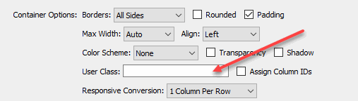
User Class
The User Class option provides a handy way to assign styling to one or more columns (cells). This tutorial will show you how to assign a column or row span to a specific cell in the grid.
We'll create a custom style rule that will target a specific column (cell) in the grid and then assign our special styling.
Create a column span style rule
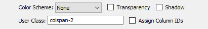
As an example, suppose you have a grid with a 3 column 3 row grid and you wish to have the first column in the second row (the 4th cell) span across two columns. We'll create a special style rule, let's call it: colspan-2, of course you can use any name you like.
-Create this style rule in your exception style sheet:
.colspan-2 .qgm-grid > .qgm-col:nth-child(4){
    grid-column: span 2;
}
This rule will only affect the 4th column (cell) designated by the 4 in nth-child(4), and will only affect the QGM grid instance that is assigned the colspan-2 user class.
Since this column (cell) is now set to span across two columns it will also affect how the grid re-flows for the Responsive Conversion. To correct for this we'll need to add an additional media query rule to undo the span so that the responsive conversion can work as desired.
-Add this rule to your exception style sheet:
@media only screen and (min-width: 0px) and (max-width: 768px) {
  .qgm-grid > .qgm-col {
      grid-column: span 1 !important;
  }
}
There are other ways to handle this conversion but this is the safest approach and will work consistently with your chosen Responsive Conversion method.
-Save the style sheet.
Assign the User Class
-Open the QGM Modify interface and enter the custom class name: colspan-2 into the User Class option box
-Click the OK button to close the interface and apply the change.
Note: Dreamweaver Design View is not able to render the nth-child css so you will not see a change in Design View. The page will, however, work and display perfectly in all modern browsers.
-Now preview the page.
This assigns a 2-column span to only the 4th column (cell) of the grid. The remaining columns (cells) are unaffected.
Column 1
Lorem ipsum dolor sit amet, consectetuer adipiscing elit, sed diam.
Column 2
Lorem ipsum dolor sit amet, consectetuer adipiscing elit, sed diam.
Column 3
Lorem ipsum dolor sit amet, consectetuer adipiscing elit, sed diam.
Column 4
Lorem ipsum dolor sit amet, consectetuer adipiscing elit, sed diam nonummy nibh euismod tincidunt ut laoreet dolore magna aliquam erat volutpat.
Column 5
Lorem ipsum dolor sit amet, consectetuer adipiscing elit, sed diam.
Column 6
Lorem ipsum dolor sit amet, consectetuer adipiscing elit, sed diam.
Column 7
Lorem ipsum dolor sit amet, consectetuer adipiscing elit, sed diam.
Column 8
Lorem ipsum dolor sit amet, consectetuer adipiscing elit, sed diam.
Column 9
Lorem ipsum dolor sit amet, consectetuer adipiscing elit, sed diam.
Create a row span style rule
We can also have a column (cell) span across 2 or more rows. We'll create a style rule named: rowspan-2 that sets the first (1st) and fifth (5th) columns (cells) to span 2 rows. We can create a compound selector that targets the 1st, and 5th columns (cells).
-Add this rule to your exception style sheet:
.rowspan-2 .qgm-grid > .qgm-col:nth-child(1),
.rowspan-2 .qgm-grid > .qgm-col:nth-child(5) {
	grid-row: span 2;
}
-Save the style sheet.
-Add the custom class name: rowspan-2 to the User Class option box
-Click OK to close the interface and apply the change.
-Preview the page.
This assigns a 2-row span to only the 1st and 5th columns (cells) of the grid. Additionally, the colspan-2 rule is also in effect. The remaining columns (cells) are unaffected by this style rule.
Column 1
Lorem ipsum dolor sit amet, consectetuer adipiscing elit, sed diam.
Column 2
Lorem ipsum dolor sit amet, consectetuer adipiscing elit, sed diam.
Column 3
Lorem ipsum dolor sit amet, consectetuer adipiscing elit, sed diam.
Column 4
Lorem ipsum dolor sit amet, consectetuer adipiscing elit, sed diam nonummy nibh euismod tincidunt ut laoreet dolore magna aliquam erat volutpat.
Column 5
Lorem ipsum dolor sit amet, consectetuer adipiscing elit, sed diam.
Column 6
Lorem ipsum dolor sit amet, consectetuer adipiscing elit, sed diam.
Column 7
Lorem ipsum dolor sit amet, consectetuer adipiscing elit, sed diam.
Column 8
Lorem ipsum dolor sit amet, consectetuer adipiscing elit, sed diam.
Column 9
Lorem ipsum dolor sit amet, consectetuer adipiscing elit, sed diam.
Additional Notes:
1. Row Span Responsive Conversion -Ordinarily we do not need to make any special row span adjustments for the Responsive Conversion since row spans affect the rendering vertically. If you do want to restore the rows pan to normal for the Responsive Conversion just add this rule to the media query that we created earlier:
@media only screen and (min-width: 0px) and (max-width: 768px) {
  .qgm-grid > .qgm-col {
      grid-column: span 1 !important;
      grid-row: span 1 !important;
  }
}
2. Extra Columns (cells) -Depending on the number or type of row/column spans you assign you may end up with what appear to be extra cells. Unlike in a table, the column or row spans do not replace (or merge) any other columns (cells) so you will see the reaming columns rendered. This may be desired, or you can simply remove the extra columns (cells):
-In Design View, click inside the extra column you wish to remove.
-On the Tag selector (at the bottom of the Design View) select qgm-col div.
-Hit the Delete key.
The extra column (cell) is now removed. Note, however, any columns removed like this will be restored whenever you use the QGM Modify interface. In that case simply repeat the above to remove the extra columns (cells).
...And Just for Fun
Here's an example of multiple column and row spans... just to show what's possible.
In the above example we created the demo-span style rule and entered it into the User Class box. The same class name is used to set the spans for all 5 columns (cells):
.demo-span .qgm-grid > .qgm-col:nth-child(1) {
	grid-row: span 6;
}
.demo-span .qgm-grid > .qgm-col:nth-child(5) {
	grid-column: span 2;
	grid-row: span 3;
}
.demo-span .qgm-grid > .qgm-col:nth-child(9) {
	grid-column: span 3
}
.demo-span .qgm-grid > .qgm-col:nth-child(20) {
	grid-column: span 5;
}
.demo-span .qgm-grid > .qgm-col:nth-child(23) {
	grid-row: span 3;
}
PVII tools make Dreamweaver better.