PVII Quick Grid User Guide
Overview
Quick Grid Magic (QGM) is a Dreamweaver extension that allows you to add multiple row/column CSS Grid structures to an existing page or inside a panel widget in just a few seconds with markup and CSS that is clean, efficient, and easy to understand.
QGM leverages the power of the modern CSS Grid specification to allow you to easily create and manage the grid structure. Create one row or multiple row column structures, complete with styling, all within the user interface... No Coding Needed!
You can have multiple Quick Grid instances on the same page, as many as you like. You can even create QGM instances inside another QGM instance (nesting), allowing for the creation of very complex grids. Each QGM instance on your page is managed individually with its own dedicated user interface—allowing you to set unique options for any QGM on your page.
The QGM user interface is designed to automatically open to the correct mode based on your current insertion point in the document. If your cursor is inside an existing QGM, the UI will open in Modify (edit) mode. If your cursor is not inside an existing menu, the UI will open in Create mode.
Grid Rows and Columns
The CSS Grid structure is similar to a <table> in that we refer to rows and columns as the elements of the grid. The columns can be thought of as the table cells. In a CSS Grid only the columns are created in the HTML markup. The rows are implicit and the grid will create as many rows as needed to display all of the columns (cells). Each row will follow the layout characteristics defined by the Column Layout method chosen.
Installing the Extension
Extensions are installed using the Adobe Extension Manager (CS6 and older), or PVII Extension Manager, or other third party extension manager.
Unzip the product file
Unzip your product file before installing.
Save for a rainy day
Save your original product file in logical folders, named and situated where you will be able find them when you need them. A good idea is to create a new folder on your hard drive and name it PVII Extensions. When you download a product file from us, place the zip file in this folder.
Extension File Types:
Extension installer files come in 2 formats: MXP and ZXP.
- MXPs are supported by Extension Manager versions MX, MX2004, 8, CS3, CS4, CS5, CS5.5 and CS6.
- ZXP is supported by versions CS6 and all Creative Cloud version (CC).
To continue to support all Adobe customers, regardless of version, we include both the classic MXP and the new ZXP versions.
To install this product:
- Open your Extension Manager
- Click the Install icon or link
- Browse to where you unzipped the installer file
- Select the extension file (either .zxp or .mxp file format)
- Be sure to re-start Dreamweaver after the extension is installed.
Accessing the Quick Grid Interface (UI)
The Quick Grid Magic user interface is a simple, straightforward layout which will allow you to create and/or modify modern, cutting edge CSS Grids in seconds.
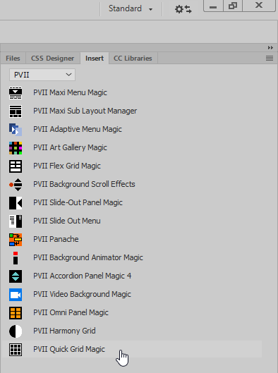
To access the UI, place your cursor on your page where you want to create your Quick Grid structure. To open the UI, locate and click the Quick Grid icon your Insert Bar or Insert Panel in Dreamweaver:
Insert Bar
Choose the PVII tab (or the PVII category if your insert bar is configured with a drop-down menu)
![]()
The Quick Grid icon is the last one in the screen capture above.
Insert Panel
Choose the PVII category from the drop-down list at the top of your Insert Panel.

The Quick Grid icon is the last one in the screen capture above.
DW Insert Menu
You can always open the user interface using the main Dreamweaver menu:
Choose Insert > Studio VII > Quick Grid Magic by PVII...
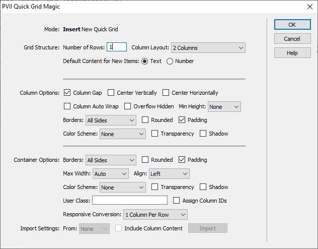
The Quick Grid UI will launch in the appropriate mode. If your cursor was positioned in a blank area of the page, and outside any other Quick Grid instance, the UI will open in Create New Quick Grid mode.

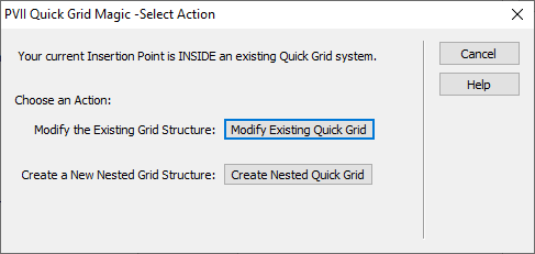
If your cursor is positioned inside an existing Quick Grid instance, you will see an intermediate UI that asks if you'd like to Modify an Existing QGM Grid or Create a Nested QGM Grid.

If you choose Create Nested Grid the interface will open in Create Mode.
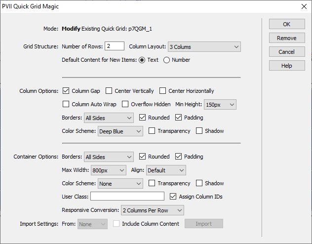
If you choose Modify Existing Quick Grid the interface will open in Modify Mode:

Using the Modify Mode you can make changes to any of the settings and options at any time. You can even change the Number of Rows and the Column Layout.
Managing the User Interface Items
Grid Structure
Number of Rows
Enter the number of rows you would like for the grid. Each row will contain the Column Layout selected. You can change the number of rows at any time to either increase or decrease the number of rows contained in the grid. The height of each row will be determined by the tallest column in that row.
Column Layouts
Select one of the column layouts in this listing. This can be though of as the template for how each column in a row will display. Every row will render with this same Column Layout method. You can change this selection at any time.
Default Content for New Items
You can select the type of default content that appears in each column so make it easier to edit with your content:
- Text: This will create a paragraph containing the word Column and the column number. Choose this is you are going to enter text into the columns.
- Number: This will create a simply column number. Choose this if you are going to insert images or content other than text.
Column Options
Set the options in this section to control the rendering of all of the columns in the grid.
Column Gap
Enable this box if you wish to have a gap between the columns and rows. The default gap size is 10px. Note that the outer edges of the grid are not affected by this setting, the gap will only appear in between columns and in between rows.
Center Vertically
This option will center the content of each column vertically.
Center Horizontally
Enable this option to center the content of each column horizontally.
Column Auto Wrap
Enabling Column Auto Wrap will disregard the Number of Rows and Column Layout selection and instead render as many columns in one row as possible, allowing the remaining columns to wrap to a new row. Each column is set with a minimum width of 150px and allowed to stretch. The columns will stretch to a point where all of the columns fill the container in one row.
Overflow Hidden
By their nature, CSS Grid and elements do not report element width to the DOM in the same manner as other elements. Some widgets require that the Grid container they are placed inside of have overflow set to hidden. When this need arises, simply enable the Overflow Hidden option.
PVII widgets that need this setting include Tab Panel Magic 3, Headline Scroller, and Image Gallery Magic 2.
Min Height
In cases where you would like the columns to render with a longer height than needed, especially when centering content vertically, you can choose to use a minimum height. All of the columns in the grid will be rendered with this minimum height. Choose from:
- None -No minimum height will be used.
- 50px -Each column height will be at least 50px.
- 100px -Each Column height will be at least 100px.
- 200px -Each Column height will be at least 200px.
- 300px -Each Column height will be at least 300px.
- 25vh -Each column will be at least 25% of the height of the browser viewport.
- 50vh -Each column will be at least 50% of the height of the browser viewport.
- 75vh -Each column will be at least 75% of the height of the browser viewport.
- 100vh -Each column will be at least 100% of the height of the browser viewport.
Borders
Select one of the border configurations to assign borders to each column.
Tip: Border color is determined by the text color set for the column.
Rounded
Enabled this box to show rounded corners for all of the columns.
Padding
This controls the padding inside each column. Disable this option if you want your column content to completely fill the box.
Color Scheme
Select one of the 30 preset background colors. Each column will be rendered with the selected background color, the text color will be appropriate to the chosen scheme. The complete color palette of our Harmony Page Builder system is inlcuded for full compatibility, plus 10 new color choices are available.
None
Gray
Black
White
Blue
Deep Blue
Bright Blue
Sky Blue
Silver Blue
Sand
Dark Sand
Light Sand
Slate
Light Slate
Yellow
Light Yellow
Green
Mint
Forest
Mist
Red
Wine
Rust
Silver
Purple
Lavender
Beige
Gold
Orange
Coral
This color chart is an actual live Quick Grid Magic instance.
Transparency
Enable this option if you want your column color scheme's background to be semi-transparent.
Shadow
Enable this option to show a drop shadow around each column.
Container Options
Set the options in this section to control the rendering of the outer container of the grid.
Borders
Select one of the border configurations to assign borders to the outer edges of the grid.
Rounded
Enabled this box to show rounded corners for the outer edges of the grid.
Padding
This controls the padding between the outer edges of the grid and the column edges. Disable this option if you want your columns to completely fill the box.
Max-Width
Be default the grid will stretch to fill the html element which contains it. You can limit the width amount by selecting one of the defined maximum widths.
Align
This options controls the horizontal alignment of the grid box with respect to its parent element: left aligned, centered, or right aligned.
Color Scheme
Select one of the 30 preset background colors, the same as the Column Color Scheme. The grid box will be rendered with the selected background color, the text color will be appropriate to the chosen scheme.
Transparency
Enable this option if you want the container color scheme's background to be semi-transparent.
Shadow
Enable this option to show a drop shadow around the container.
User Class
You can assign an optional User Class to the container. You can also add multiple classes . To do so, enter each class name separated by a space. The User class is a powerful features in Quick Grid. It allows you full freedom to customize styling beyond the options in the UI.
Assign Column IDs
With this option enabled the QGM system will assign a unique element id to every column (cell).
The format for this id is qgm-[root QGM number]-[column number] like:
<div id="qgm-2-5" class="qgm-col">
The above id is assigned to the fifth column (5) in the second (2) QGM instance on the page.
You can then create a style rule that targets this column:
#qgm-2-5 {
     background-color: rgba(0 128 128, 0.9);
     color: #fff;
}
This will set a teal background color and white text for the 5th column in the 2nd instance of QGM on the page.
Responsive Conversion
Quick Grid Magic provides a flexible approach to how the grid converts for narrow screens. This choice should be made based on the content you have in the columns and your general design goals:
- None (No Conversion)
- 1 Column per Row
- 2 Columns per Row
- 3 Columns per Row
- 4 Columns per Row
Import Settings
QGM includes a handy utility to quickly import the options and settings from another Quick Grid on the page. This allows you to quickly prototype grid implementations and can save a lot of time by avoiding repetitive tasks. You can also, optionally, choose to import the content of each column!
Note: This option is only available when you already have an existing QGM on the page.
From
Select the QGM construct that you wish to import from.
Include Column Content
Enable this box if you wish to also import the content in each of the columns.
Import
Click this button to start the Import process. A message box will appear when the import is finished.
© Copyright 2021-2022 Project Seven Development. All Rights Reserved.