Overview
Panache installs into Dreamweaver, giving you access to a fully automated interface in which you can choreograph intricate animation sequences. Animations can be simple effects, triggered on page load, when scrolled to, or when a trigger link is depressed. Animations can also be assigned to multiple elements to tell a story or provide engaging emphasis to a marketing message.
Read on and see how it all comes together...
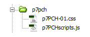
Panache Asset Folder
When you create a Panache animation, the system will automatically create the asset files and folders necessary, and link them to your page. The main asset folder is called p7pch.
When publishing your site, make sure to upload the entire p7pch folder.
Installing Panache
Extension installer files come in 2 formats: MXP and ZXP. MXPs are supported by Extension Manager versions MX, MX2004, 8, CS3, CS4, CS5, CS5.5 and CS6. ZXP is supported by versions CS5.5 and higher, including Creative Cloud versions. To install, open the relevant Extension Manager, click the Install icon or link, and then browse to where you unzipped the installer file.
Relevant Extension Managers
For Dreamweaver MX, MX 2004, CS3, CS4, CS5, CS5.5, and CS6, use the Macromedia or Adobe Extension Manager that automatically installed with Dreamweaver.
For Creative Cloud versions, use the free PVII Extension Manager for Adobe Creative Cloud:
PVII Extension Manager for Adobe CC
( Windows and Mac)
Accessing the Panache UI
There are 3 ways to access the UI. Choose the one most suitable to your workflow. When you open the interface, the system will detect the appropriate mode (Insert or Modify) based on your cursor location.
When you are Creating a new animation instance, place your cursor on your page where you want to build it. If Modifying an existing instance, place your cursor anywhere inside the existing animated element and use one of the 3 methods below to open the UI. The system will always open in the correct mode.
1. Insert Bar
Switch to the PVII category. The Panache icon should be the last on on the bar.

2. Insert Panel
Switch to the PVII category.
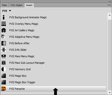
3. Insert Menu
Choose Insert > Studio VII > Panache by PVII
If your cursor is not inside an existing Panache instance, the main UI will open in Create Mode.
If your cursor is inside an existing instance, the UI will open in Modify mode.
Selecting Elements to be Animated
With Panache, you're going to be working with elements that are already on your page—elements such as headings, paragraphs, images, and DIVs, for example.
How to Select
Place your cursor inside the element you wish to animate. To ensure a good selection, you can use the Tag Selector bar that runs along the bottom of your Dreamweaver window. For example, to select a paragraph (like this one), place your cursor inside and click the corresponding <p> tag on the Tag Selector bar.
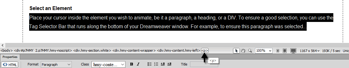
When you select the <p> tag, the paragraph will highlight. Use this method to select any element. You can also use this technique in code view, in which case the entire tag, along with its content, will highlight.
Things to Consider
When you plan your animations, there are a few things to keep in mind.
Single or Multiple Elements
You can animate a single heading and its following paragraph separately, or you can group them together and animate them as a unit. For example, to animate a heading and 2 related paragraphs...
<h1>Hello World</h1>

          <p>Take me to your leader.</p>

          <p>I come in peace.</p>
Wrap a generic DIV around it and select that DIV for your animation:
<div>

          <h1>Hello World</h1>

          <p>Take me to your leader.</p>

          <p>I come in peace.</p>

          </div>
Implode and Elastic Animations
Implode and Elastic animations should be restricted to a single element, as they do not work well when grouped inside a containing DIV.
Typewriter Animation
The Typewriter animation should be limited to content comprised of either headers, paragraphs, or a combination of both.
Harmony and Layout Builder Considerations
Panache works very well in Harmony or Layout Builder pages. However, you cannot select a Harmony or Layout Builder DIV as your element to be animated. If, for example, you want to animate this entire Harmony column:
<div class="hmy-content hmy-left">

          <p>Column content...</p>

          </div>
Wrap the inner content inside a DIV. You can optionally assign a class name if you'd like to style that content:
<div class="hmy-content hmy-left">

          <div class="my-content-wrapper">

          <p>Column content...</p>

          </div>

          </div>
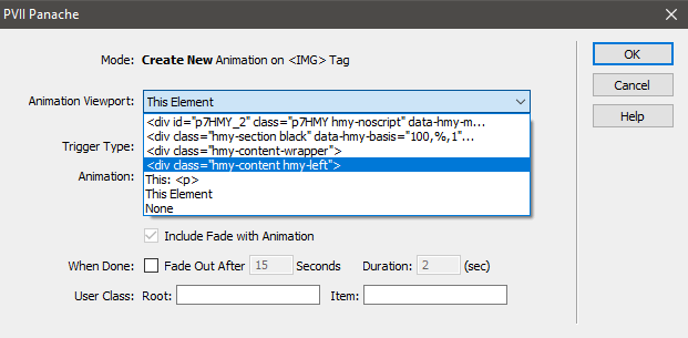
Setting a Viewport
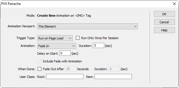
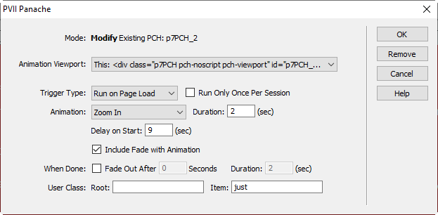
Some animations require setting a parent element on the page to a viewport. This can easily be done in the Panache interface from a drop-down list containing all of the parent elements of the selected element.
The Default Viewport
When you create a new Panache animation, the default viewport is set to This Element, which is the viewport you should use for the following animations:
- Fade In
- Slide In From Left
- Slide In From Right
- Zoom In
- Typewriter
Viewports for Vertical Sliding Animations
The other animations require you to choose a viewport that best renders your animation. For instance, this text is inside a row that has a nearly-black background color. If we wanted to slide in a picture from the bottom, we would want the image to appear to slide up from the lower edge of the row, rather than from the bottom of the page, or worse, from the element's natural boundaries, which are only as high as the image. To accomplish that, we would want to choose the actual element that is colored black, which in this case is our Harmony content DIV. The Image is set to Slide Up on page scroll.
Click the red button above the image to replay the animation.
The image comes in from the lower boundary of the black row, which is exactly what we want! So, a good rule of thumb is that when sliding from the top or the bottom, select a viewport that is the nearest bordered or colored parent of your animated element.
Viewports for Imploding and Elastic Animations
Imploding or Elastic animations are quite unique and eye-catching. To optimize the effect it is key that you choose the appropriate viewport. Let's do a little example and see how it works. Click the button below to bring in a heading using the Elastic Character animation.
Run or Replay Elastic Animation
Elastic Characters are Very Cool!
Since we are relatively close to the middle of the page, an appropriate viewport would be the root Harmony DIV (p7HMY_2) that contains the content of this guide. That is, the area between the menu and the footer. This is a good choice viewport choice because the Implode and Elastic animations are staged between 200 and 600 pixels north and south of the element's final resting place. Our chosen viewport, then, will provide an ideal container.
Tip: If you animate an element near top of the page with an Implode or Elastic effect, the body itself might be your ideal viewport. The body, however, cannot be set as a viewport because that would prevent your page from spawning scroll bars. To get around that, you can simply wrap all markup within your opening and closing body tags with a DIV:
<body>

            <div class="page-wrapper">

            All your existing page markup is in this area...

            </div>

            </body>
Now you can choose the page-wrapper DIV as a viewport.
Interface Options and Settings
Mode
When you open the UI, the system will detect whether or not your cursor is inside an existing Panache animation, opening in the appropriate mode: Create New Animation or Modify Existing PCH: [ID of selected animation].
Animation Viewport
Select from a list of DIVs on your current page. Remember, the viewport you choose creates the outer boundaries for your animation. Please see Viewport sections above for greater detail.
Trigger Type
There are 4 choices:
1. Manual
Select this method if you would like your animation to be triggered by a user click or tap. For related information please see the Control Behavior section below.
2. Run on Page Load
The animation will start when the page loads.
3. Run When in View
The animation will run when the area containing the animated element has been scrolled into view. If you subsequently scroll out of view, the animation will reset and run again each time you scroll back into view.
4. Run on Scroll To
The animation will run once, when the element is scrolled to. Scrolling away from the element will not reset the animation.
Run Only Once Per Session
Active only when the Run on Page Load Trigger Type is selected. With this option enabled the page load animation will only run once per user session. Subsequent page reloads, back button or links back to the page will suppress the animation.
Animation
Choose an animation. The choices are listed in the screen capture below:
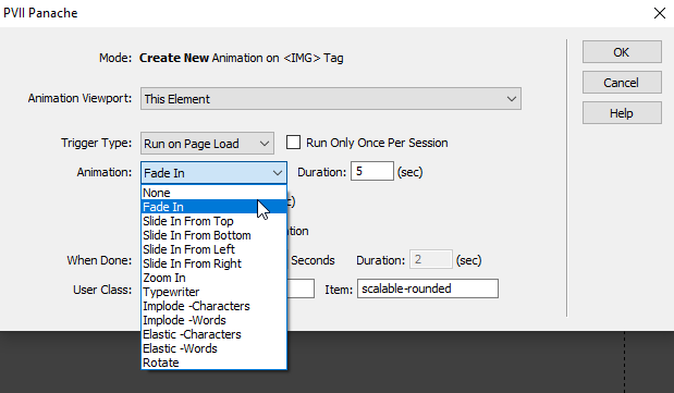
Duration
This is the amount of time the animation will run—from start to finish. The shorter the time, the faster the animation.
Delay on Start
You can set a delay in seconds. The delay is essentially a countdown, starting when the animation is triggered (either on load, scroll to, when in view, or manually) and counting down from the delay you set to zero.
Include Fade With Animation
With this option selected, the animated element will fade in as the animation progresses. Naturally, this setting is unavailable (grayed out) for the Fade-In and Typewriter animations.
When Done
You can set any animation to fade out (disappear) a set time after the animation finishes. You can also set a Duration for the fade-out.
User Class
You can set a user class on the Root Panache element or the animated Item element.
Control Behaviors
Panache ships with a Control Behavior that you can use to make Manual Triggers. These triggers can be used to Play and/or Replay animations, or to stop all animations, which in effect is tantamount to a Skip Animation control. To create a manual trigger with a Control Behavior, follow these simple steps:
Create your animation
After creating your animation, switch to code view. Make a new paragraph just above the root PCH DIV for your animation, which looks like this.
<div id="p7PCH_3" class="p7PCH...>
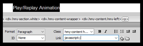
Type the text for your trigger on the new paragraph:
<p>Play/Replay Animation</p>

          <div id="p7PCH_3" class="p7PCH...>
Switch back to design view.
Select the text inside the paragraph and type the following into the Link box on your Property Inspector:
javascript:;
Place your cursor inside the linked text and open the Tag Inspector panel:
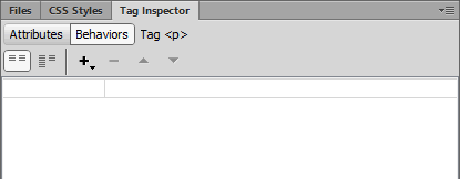
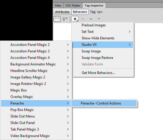
Select the Behaviors tab, then the + sign.
Choose Studio VII > Panache > Panache Control Actions
The Control Action UI will open:
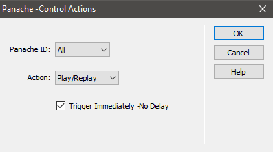
From the Panache ID list, choose All or the ID of the animation you want to trigger. The ID can be found on the root PCH DIV:
<div id="p7PCH_3" class="p7PCH...>
In the Action list, choose from:
Play/Replay
This action creates a toggle control. The first click/tap will run the animation. Click/tap again and the animation will replay.
Stop
This action will stop all animations and set all animated elements to the states they would assume if all animations had run and completed.
Reset
This action resets all animated content to their initial default states.
Tip: Run this behavior for All animations to provide a Skip Animation link. All staged content will be visible.
Trigger Immediately - No Delay
Checked: The trigger behavior will fire and all affected animations will run or stop immediately, without delay.
Un-checked: The behavior will use the existing Delay settings from your animation(s).
Click OK to build your Control Action link.
In Code View, your link will look something like this:
<a onClick="P7_PCHctrl('p7PCH_1','replay',1)" href="javascript:;">RUN</a>
Your Behaviors Panel will show the assigned Behavior:
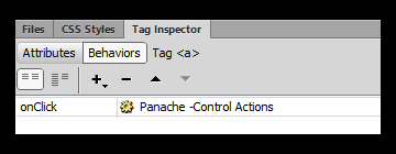
Double-clicking Panache - Control Actions will open the Control Action UI in Modify Mode.
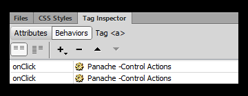
You can also click the + sign to add a second Panache Control Action to your link, which could be very handy if you wanted your link to control 2 or more animations in proximity. With 2 Actions assigned, the panel would look like this:
And your code would look like this:
<a onClick="P7_PCHctrl('p7PCH_1','replay',1); P7_PCHctrl('p7PCH_2','replay',1)" href="javascript:;">RUN</a>
Manual Trigger Styling
We've included 2 CSS classes in the Panache style sheet that you can customize. The classes will automatically affect all Panache Manual Trigger links on your page. The classes can be found near the bottom of your CSS file:
a[onclick^="P7_PCHctrl"] {

font-size: inherit;

}

a[onclick^="P7_PCHctrl"]:hover {

font-size: inherit;

}
As they are, these classes do nothing. But once you customize them, they can take on any look you want. Here are the rules we are using for the animation trigger links on this page:
a[onclick^="P7_PCHctrl"] {

display: inline-block;

padding: 15px;

text-decoration: none;

border-radius: 4px;

transition: all linear .5s;

border: 1px solid;

background-color: #F33;

color: #000;

}

a[onclick^="P7_PCHctrl"]:hover {

background-color: #000;

color: #FFF;

border-color: rgba(0,0,0,0);

}
Accessibility
Panache, as well as Panache Manual Triggers can fit inside an accessible web site. If you need to meet certain accessibility standards, we recommend adding an aria-label attribute to your trigger links. Consider this example:
<a href="javascript:;" onClick="P7_PCHctrl ('p7PCH_3','replay',1)" aria-label= "This link triggers the animation of an element already in the page. Please disregard."> Run or Replay Elastic Animation</a>
That's it. All other aspects of Panache are fully accessible.
UI Command Buttons
The right edge of the UI contains a set of command buttons. The button set will differ by one depending on whether the UI is open in Create or Modify Mode.
Create Mode Command Buttons
OK
Build the animation
Cancel
Close the UI without adding an animation to your page.
Help
Open this user guide.
Modify Mode Command Buttons
The Modify UI adds on additional button: Remove.
Remove
Click this button to remove the selected animation. If this is the only animation on your page, the links to the CSS and script files will also be removed.
Support Options
Before making a support inquiry, please be certain to have read the documentation that came with your product. Please include your Order Number, Dreamweaver version, as well as your computer operating system type in all support correspondence.
Support Forum
PVII maintains a Web Forum community. Go Direct to the Web Forum
E-Mail and Phone Support
E-Mail: support@projectseven.com
Phone: (336) 374-4611
Phone hours are 9:00am - 5:00pm Eastern Time U.S.