PVII Headline Effects Magic User Guide
Overview
Headline Effects Magic (HFX) is a Dreamweaver extension designed to breathe new life into your web pages. The HFX system provides a fully automated interface in which you can choreograph intricate animation sequences for text items on your page. While it is designed to present engaging animated heading text it can be assigned to any string of text on your page.
Use HFX to creatively enhance your message, draw focus, and increase user engagement.
What is HFX?
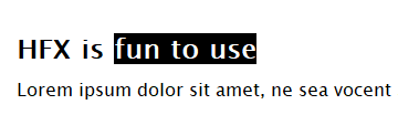
HFX is a text rotator system that applies animations to each rotation. The Text Items can consist of any text phrase, one or more words.
Text Items can be displayed in one of 3 Configurations:
- Show Only One Text Item at a Time,
- Reveal Each Text Item Horizontally
- Reveal Each Text Item Vertically
HFX Asset Folder
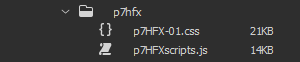
When you create a HFX animation, the system will automatically create the asset files and folders necessary, and link them to your page. The main asset folder is called p7hfx.
When publishing your site, make sure to upload the entire p7hfx folder.
Installing the Extension
Extensions are installed using the Adobe Extension Manager (for CS6 and older), or a third party Extension Manager (all DW CC versions).
Unzip the product file
Unzip your product file before installing.
Save for a rainy day
Save your original product file in logical folders, named and situated where you will be able find them when you need them. A good idea is to create a new folder on your hard drive and name it PVII Extensions. When you download a product file from us, place the zip file in this folder.
Extension File Types:
Extension installer files come in 2 formats: MXP and ZXP.
- MXPs are supported by Extension Manager versions MX, MX2004, 8, CS3, CS4, CS5, CS5.5 and CS6.
- ZXP is supported by versions CS6 and all Creative Cloud version (CC).
To continue to support all Adobe customers, regardless of version, we include both the classic MXP and the new ZXP versions.
To install this product:
- Open your Extension Manager
- Click the Install icon or link
- Browse to where you unzipped the installer file
- Select the extension file (either .zxp or .mxp file format)
- Be sure to re-start Dreamweaver after the extension is installed.
Accessing the Headline Effects Interface (UI)
The Headline Effects Magic user interface is a simple, straightforward layout which will allow you to create and/or modify modern, cutting edge Headline Effects in seconds.
Establish a text selection or insertion point
With HFX, you're going to be working with text that is already on your page; text in elements like headings or paragraphs.
-Select the word ( or words) that you wish to apply the Headline Effect to:
-Open the HFX interface by using one these three methods:
- Insert Bar
Choose the PVII tab (or the PVII category if your insert bar is configured with a drop-down menu)
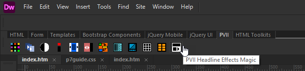
The Headline Effects icon is the last one in the screen capture above.
Note: Dreamweaver CC ships with the Insert Panel / Bar set to Panel View as default. To change this to the classic Insert Bar of icons that run horizontally across the top of your application window, follow our 'Restoring Dreamweaver's Classic Insert Bar' tutorial.
- Insert Panel
Choose the PVII category from the drop-down list at the top of your Insert Panel.
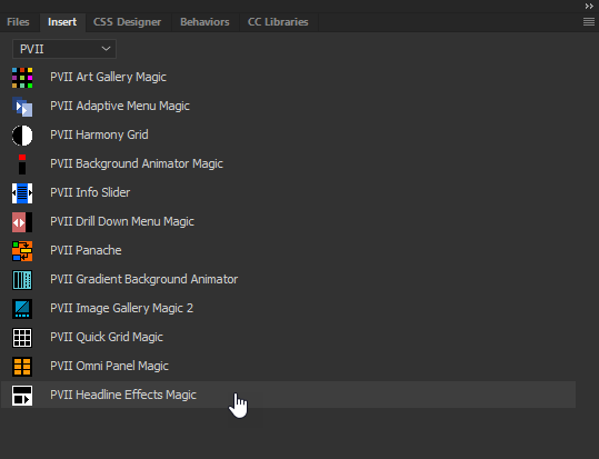
The Headline Effects icon is the last one in the screen capture above.
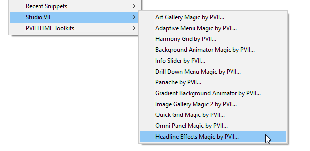
- DW Insert Menu
You can always open the user interface using the main Dreamweaver menu:
Choose Insert > Studio VII > Headline Effects Magic by PVII...
The Headline Effects magic user interface will open in Create mode with the selected text already entered as the first text item.
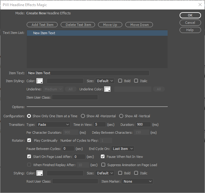
-Click the Add Text Item button to add more text items for the HFX system to rotate through.
-Set your options and then click OK to create the HFX instance.
Opening the Headline Effects Modify Interface (UI)
-To open the Modify interface click inside the text of an exciting HFX instance.
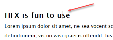
-Click the Headline Effects Magic icon in the Insert Panel or Insert Menu.
The Headline Effects UI will launch in the Modify mode:
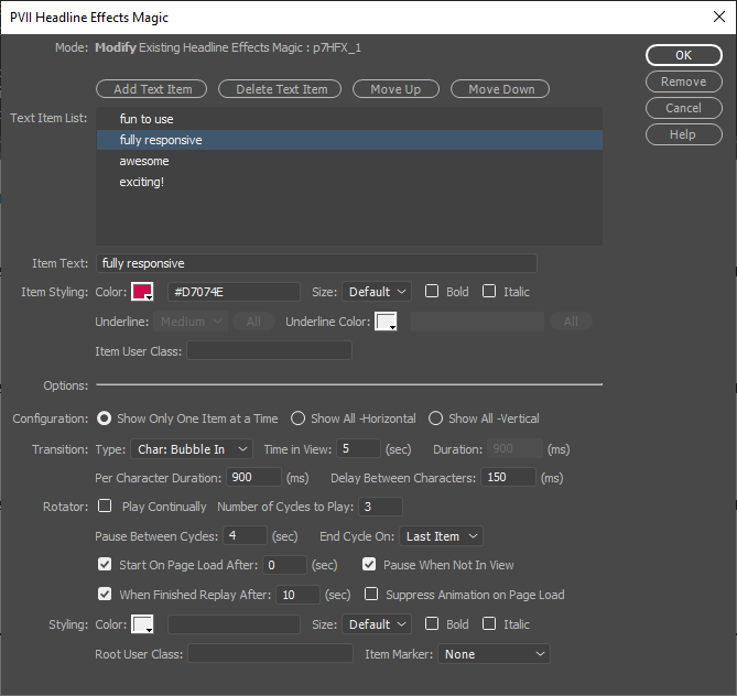
-Using the Modify Mode you can make changes to any of the settings and options at any time.
Managing the User Interface Items
Mode
Displays the current operational Mode for the user interface: either Create or Modify. When in Modify mode, the id of the HFX instance being modified will also be displayed.
Text Item List
This box displays the string of text, one or more words, to be animated; one line for each string of text. Select (click) the line you wish to act on.
Add Text Item
Click the Add Text Item button to add a new string of text. A new line will be created with the default text New Text Item. The new line will be created immediately after the currently selected line.
Delete Text item
Click the Delete Text Item button to remove the currently selected line.
Move Up
The Move Up button will move the selected line in the Text Item List up one row. Successive clicks will keep moving the line up, one row per click, until the line is at the top of the list.
Move Down
The Move Down button will move the selected line in the Text Item List down one row. Successive clicks will keep moving the line down, one row per click, until the line is at the bottom of the list.
Item Text
Enter the text string you wish to display, one or more words. The system will display New Item Text as the default text when first adding a new Text Item. The box cannot be left blank.
Item Styling
These options apply to the Text Item currently selected in the Text Item List.
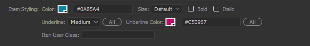
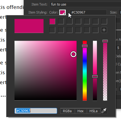
Color
Use the handy color picker or enter your desired color code into the box. The format for the colors can be hex, rgb, rgba, or color names. You can edit, add or remove these colors at any time.
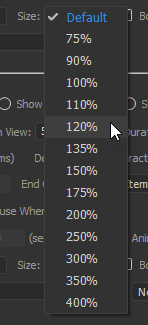
Size
Select one of the preset font size options to display the currently selected Text Item at a different size. This option has no effect on the font size when left at the Default setting.
Bold
Check this option to have the Text Item display in Bold.
Italic
Check this option to have the Text Item display as italic.
Underline
This section is only active when the Underline Transition Type is selected. The color and the thickness of the underline can be individually set for each Text Item. There is also an All button for each that will apply your current settings to all of the Text items.
Underline Type
Select the underline thickness: Thin, Medium, or Thick.
Underline Color
Use the handy color picker or enter your desired color code into the box. The format for the colors can be hex, rgb, rgba, or color names. You can edit, add or remove these colors at any time.
Item User Class
You can assign an optional User Class to the each Text Item. You can also add multiple classes . To do so, enter each class name separated by a space. The User class is a powerful feature in HFX. It allows you full freedom to customize styling for each Text Item beyond the options in the UI.
Options
Set the options in this section to control the operation of the HFX system.
Configuration
The HFX system can be set to operate in one of three different configurations:
Show Only One Item at a Time (default mode)
Each Text item will replace the previous Text Item, only the current text Item is displayed.
Show All -Horizontal
Each Text Item will display to the right of the previous Text Item (horizontally), the previous Text Item(s) will continue to display.
Show All -Vertical
Each Text Item will display below the previous Text Item (vertically), the previous Text Item(s) will continue to display.
Transition
This section allows you to control all aspects of the Text Item transition animations.
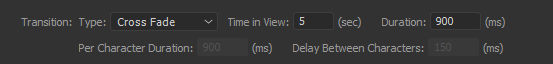
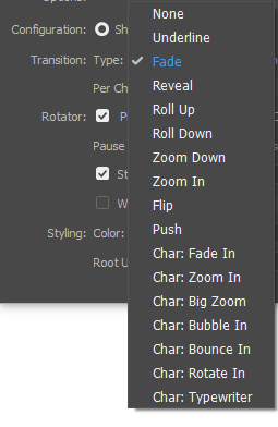
Type
Select the desired animation, choose from 16 animation types:
Time In View
This sets the amount of time, in seconds, each Text Item is displayed before the next Text Item is shown.
Duration
Set the number of milliseconds the animation takes for each Text Item display. This setting will determine how fast the animation moves. This option is disabled when a Character animation is selected.
Per Character Duration
Enabled only when a Character animation is selected, this option will determine the animation speed for each character. Set the number of milliseconds the animation takes for each character.
Delay Between Characters
Enabled only when a Character animation is selected, this option will determine the time delay between each character animation. Set the number of milliseconds to wait before displaying the next character.
Rotator
This section controls the auto-play Rotator functionality.
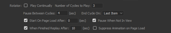
Play Continually
This option allows the Rotator to play through the Text Items indefinitely.
Number of Cycles to Play
Enter the number of times you wish Rotator to play through all of the Text Items.
Pause Between Cycles
This option will pause the set amount of seconds before repeating the next cycle. Enter the number of seconds to pause. The default is 0 (zero).
End Cycle On
This allows you to choose the ending Text Item for the Rotator cycle. When the Rotator has completed the assigned number of rotations it will stop on:
- Last Image -The Rotator will stop at the last Text Item in the Text Items list.
- First Image - When the Rotator reaches the last Text Item it will loop back and stop at the first Text Item in the Text Item list.
Start On Page Load After
The Rotator will start automatically when the page first loads. This option is enabled by default. With this option turned off the Rotator will not run unless started by a Control Action. Enter the number of seconds to pause before starting the Rotator.
Pause When Not In View
This feature saves browser resources and is enabled by default. The HFX animations will only run when the page element to which they are assigned are currently in view.
When Finished Replay After
After the set number of Cycles has run this feature will restart the Rotator after the defined number of seconds. For example, the Rotator could run two cycles, then pause for 10 seconds and start the Rotator again, repeating the 2 Cycle - Pause 10 seconds indefinitely.
Suppress Animation on Page Load
This option controls the animation for the initial Text Item. Uncheck this option to allow the initial Text Item to animate when the page first loads.
Styling
These options apply to all of the Text Items in the Text Items List, unless over-ridden by an individual Text Item Style setting.
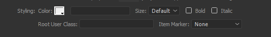
Color
Use the handy color picker or enter your desired color code into the box. The format for the colors can be hex, rgb, rgba, or color names. You can edit, add or remove these colors at any time.
Size
Select one of the preset font size options to display all of the Text Items at a different size. This option has no effect on the font size when left at the Default setting.
Bold
Check this option to have all of the Text Items display in Bold.
Italic
Check this option to have all of the Text Items display as italic.
Root User Class
You can assign an optional User Class to the entire HFX construct. You can also add multiple classes . To do so, enter each class name separated by a space. The User class is a powerful feature in HFX. It allows you full freedom to customize overall styling beyond the options in the UI.
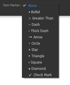
Item Marker
This option will display an item marker at the beginning of each Text Item.
HFX Control Actions
The HFX system also includes control actions that can be used to create HFX actions on links located anywhere on your page, or that can be used in by other scripts to control HFX actions.
Available Control Behavior Actions:
- Play (Resume) Rotator
- Pause Rotator
- Show First Item
- Show Next Item
- Show Previous Item
- Show Last Item
- Show Text Item Number ...
Manually Assigning HFX Control Actions
There are times when you may want to manually assigning a control action, either for use in external scripts or when building pages dynamically.
The control action function call will look like this:
P7_HFXctrl('p7HFX_1','play')
- The first argument is the ID of the HFX instance.
- The second argument is the control action you wish to apply.
The HTML markup for a typical text link with a control action applied would look like this:
<a href="#" onclick="P7_HFXctrl('p7HFX_1','play');return false;">Play</a>
The available Control Actions are:
- P7_HFXctrl('p7HFX_1','play') - Play (Resume) Rotator
- P7_HFXctrl('p7HFX_1','pause') - Pause Rotator
- P7_HFXctrl('p7HFX_1','first') - Show First Item
- P7_HFXctrl('p7HFX_1','next') - Show Next Item
- P7_HFXctrl('p7HFX_1','prev') - Show Previous Item
- P7_HFXctrl('p7HFX_1','last') - Show Last Item
- P7_HFXctrl('p7HFX_1',x) - Open the specified Text Item number, where x is the number of the Text Item
Using the HFX Control Behavior
The HFX Control Behavior will allow you to assign HFX control actions using the convenient interface.
Create a new HFX Control Action
Before accessing the HFX Control Actions interface, create a null link or an image link on which to assign your actions(s). A null link might look like this:
<a href="#">Pause Rotator</a>
To access the Control Actions interface:
- Click on the null link and choose Windows > Behaviors from the main Dreamweaver menu to open the Behaviors panel.
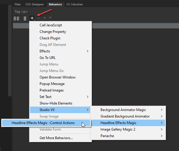
- Click the + symbol and choose:
Studio VII > Headline Effects Magic> Headline Effects Magic - Control Actions
The Control Actions dialog will open:
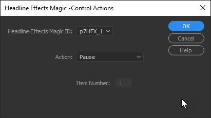
- Select the relevant HFX instance from the Headline Effects Magic ID drop-down list.
- Select a Control Action from the Action drop-down list:
- Play
- Pause
- First
- Next
- Previous
- Last
- Show Item Number...
- Click OK.
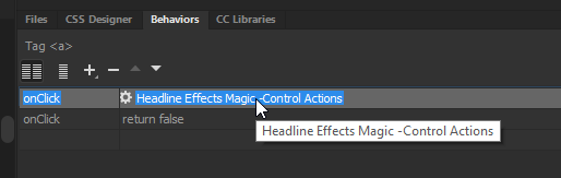
The link you created earlier will now look like this:
<a href="#" onClick="P7_HFXctrl('p7HFX_1','pause')">Pause Rotator</a>
- To finish your task, and to prevent the page from jumping when the null link is clicked, add a ;return false;
<a href="#" onClick="P7_HFXctrl('p7HFX_1','pause');return false;">Pause Rotator</a>
Modifying an existing HFX Control Action
- Select the element that contains an existing Headline Effects Control behavior.
- Double-click the Headline Effects Magic- Control Actions behavior in the Behaviors Panel to open the interface.
The HFX Behavior Modify interface will open.
Select or reset the options.
Click OK to apply the revised behavior.
© Copyright 2022 Project Seven Development. All Rights Reserved.