

The 5-Minute Harmony Layout
Harmony is all about being able to flesh out any type of page layout you can imagine. But all that power can be used to make simple layouts extraordinarily fast. Literally, in minutes For a web designer, this is not a trivial thing. It's more like being handed a magic wand—a means to handle more clients, or more projects, than you ever thought possible. So let's work together on a little project right now. Let's make a traditional 2-column page layout, composed of a masthead, a main content area, a sidebar, and a footer. Then we'll spice it up a little by fixing masthead so it sticks to the top of the page. We'll start with a new page, and if you follow each step, your layout will be finished in about 5 minutes. Speaking of finished—
We've prepared a folder, with a starter page, as well as some assets, including an images folder, for you to use while completing the tutorial. So, before you begin the tutorial, please download the following folder:
After downloading the file, unzip it inside the root of your defined Dreamweaver site.

Open the index.htm file and let's get going!
Open index.htm and let's begin the process. The page is blank and you'll use the Harmony UI to bring it to life.
Open the Harmony UI by clicking the Harmony icon ![]() on your Insert Bar or Panel
on your Insert Bar or Panel
Set the first Column according to the options below:
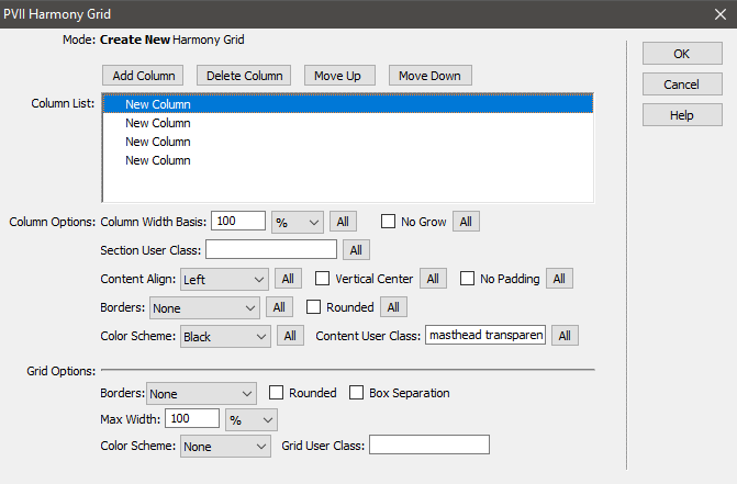
All settings and options are default with the exception of:
Column Color Scheme: Black
Content User Class: masthead transparent
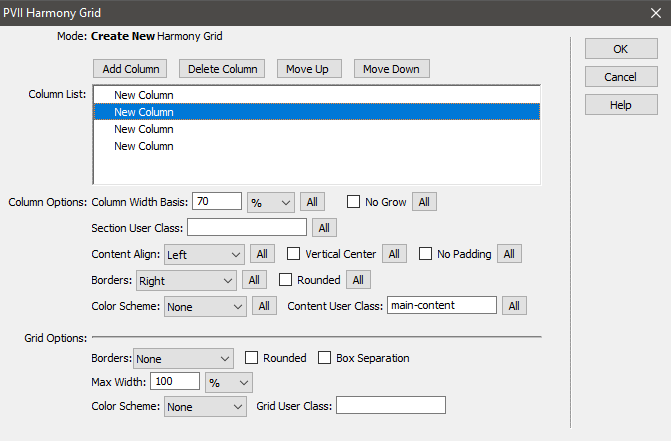
Column Width Basis: 70%
Content User Class: main-content
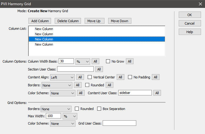
Column Width Basis: 30%
Content User Class: sidebar
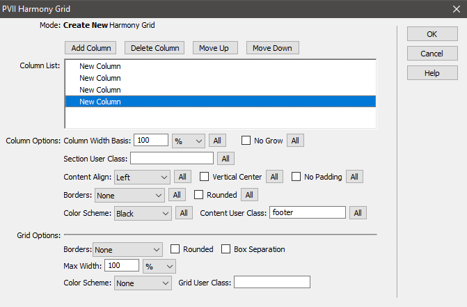
Content User Class: footer
Click OK to create the Harmony grid. In Design View, your page should look like this:
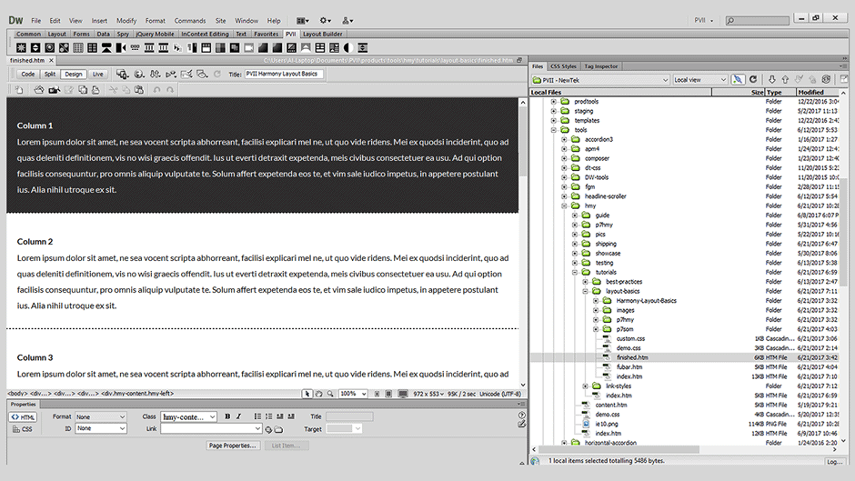
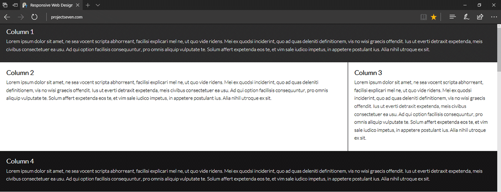
Of course, Dreamweaver Design View does not support modern CSS very well, so when you look at the page in a browser, you get a much better idea of the magnitude of what you and Harmony have just accomplished:
Let's add a little polish to our layout by fixing the masthead and adding a few nice images.
The default content inside the masthead consists of a level 3 heading and a paragraph. We're going to delete those elements and insert a logo. Now, don't get nervous, but this task is much easier to do in Code View. So, place your cursor inside the masthead and switch to Code View, which will look like this:
<div class="hmy-content-wrapper hmy-color-content-black masthead transparent">

          <div class="hmy-content hmy-left">

          <h3>Column 1</h3>

          <p>Lorem ipsum dolor sit amet, ne sea vocent scripta abhorreant, facilisi explicari mel ne, ut quo vide ridens. Mei ex quodsi inciderint, quo ad quas deleniti definitionem, vis no wisi graecis offendit. Ius ut everti detraxit expetenda, meis civibus consectetuer ea usu. Ad qui option facilisis consequuntur, pro omnis aliquip vulputate te. Solum affert expetenda eos te, et vim sale iudico impetus, in appetere postulant ius. Alia nihil utroque ex sit.</p>

          </div>

          </div>
Delete the H3 and the paragraph, leaving a blank line where those elements were, so it looks like this:
<div class="hmy-content-wrapper hmy-color-content-black masthead transparent">

          <div class="hmy-content hmy-left">


          </div>

          </div>
With your cursor on the blank line in Code View, choose Insert > Image
Browse to the images folder inside your Harmony-Layout-Basics folder and select logo-2017.png
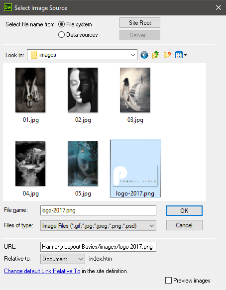
Now, of course, the image is the PVII logo, which is really cool, and you have our blessing to replace our logo with your own. We thought you should know that.
Your code should now look like this:
<div class="hmy-content-wrapper hmy-color-content-black masthead transparent">

          <div class="hmy-content hmy-left"><img src="images/logo-2017.png" width="205" height="96"></div>

          </div>
Copy the three CSS rules below and paste them inside the custom.css file in your Harmony-Layout-Basics folder.
          .masthead {

            position: fixed;

            z-index: 100;

            top: 0;

            left: 0;

            width: 100%;

            box-sizing: border-box;

            }

            .masthead .hmy-content {

            padding: 5px 10px !important;

            }
body {
padding-top: 106px;
}
The first rule sets the masthead DIV to position fixed. The second rule sets custom padding for the content DIV. The third rule (body) sets top padding to ensure that no page content gets lost beneath the fixed masthead. The amount of padding is equal to the height of the logo image (96px) plus the top/bottom padding assigned in the masthead rule.
Note: Since some versions of Dreamweaver do not support fixed position in Design View, your page will appear to begin 106 pixels from the top. This is normal. Real browsers will display it properly.
If you want to emulate our finished page, insert into your sidebar, 02.jpg, which you'll find in the images folder you downloaded.
Tip: The Harmony CSS file contains a utility class called rounded. You can assign that class to your image to round its corners (if you want).
If you want, add some additional text content, and perhaps another heading to your main-content area.
You can also edit the footer at this time.
And this is what you've done, so pat yourself on the back!
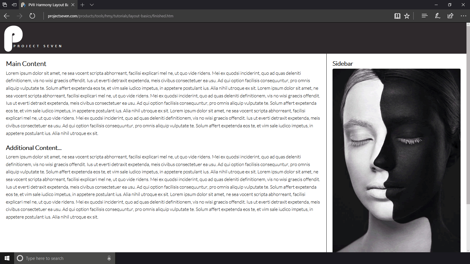
We hope you've enjoyed this tutorial as much as we did writing it. Harmony is a wonderful tool and we will be releasing many more tutorials in the future. If there is something in particular you would like to see, please do not hesitate to let us know.
In the type of layout you created, there are two types of menus that would be perfect fits:
A Tree Menu or Vertical Pop Menu Magic menu in the sidebar
Note: In our finished page, we added a Slide Out Menu.