Flex Grid Magic (FGM) User Guide
Overview
Flex Grid Magic harnesses the unique power of the CSS Flexbox specification to create flexible, adaptive, and responsive grids. FGM grids render in a masonry type configuration—a web-based rendition of a masterfully built stone wall, where each piece is uniquely sized, laid in the perfect spot, lending strength to the overall structure. It's both symmetrical and asymmetrical at the same time. The FGM UI is designed to automate the process of building grids that are ideally suited to the following tasks:
- A grid of thumbnails that can easily be made to interface with a gallery tool such as Magic Box
- A roster of employers or team members
- A calendar of events
- An adaptive portal page
- And so much more...
Installing Flex Grid Magic
Extension installer files come in 2 formats: MXP and ZXP. MXPs are supported by Extension Manager versions MX, MX2004, 8, CS3, CS4, CS5, CS5.5 and CS6. ZXP is supported by versions CS5.5 and higher. Version CC and higher have dropped support for the MXP format. To continue to support all Adobe customers, regardless of version, we include both the classic MXP and the new ZXP versions.
Dreamweaver CC 2015 (and higher) Extension Installation Information
As of CC 2015, Adobe has ceased to support its own Extension Manager. Use the PVII Extension Manager for Adobe Creative Cloud...
PVII Extension Manager for Adobe CC
( Windows and Mac)
Download and Install Instructions
Accessing Flex Grid Magic
There are 3 ways to access Flex Grid Magic. Choose the one most suitable to your workflow. When you open an interface, the system will detect the appropriate mode (Insert or Modify).
When you are Creating a new FGM instance, place your cursor on your page where you want to build the grid. If Modifying an existing FGM instance, place your cursor anywhere inside the grid and use one of the 3 methods below to open the UI. The system always open in the correct mode.
1. Insert Bar
Switch to the PVII category. Flex Grid Magic is the last one in the screen capture below
![]()
2. Insert Panel
Switch to the PVII category. Flex Grid Magic is the last one in the screen capture below
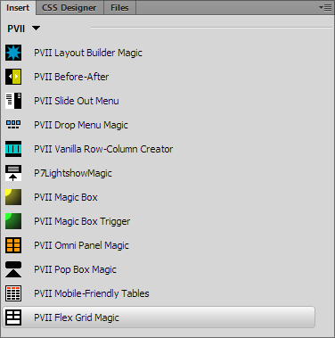
3. Insert Menu
Choose Insert > Studio VII > Flex Grid Magic by PVII
Browser Support
FGM uses the concept of progressive enhancement to build a grid that will be accessible in all browsers. All modern browsers have full support for Flexbox. This includes:
- Google Chrome
- Moziila Firefox
- Safari (mobile and desktop)
- Android
- Microsoft Edge
- Opera Chromium
Olbsolete versions of Internet Explorer will display a grid that lacks a few extra features, but that still looks quite presentable, and is totally accessible.
Flex Grid Magic Interface: Options & Settings
The Flex Grid Magic interface makes customizing your widget easy!
The FGM Interface
Creating a new FGM instance
The FGM UI allows you to easily define and configure FGM instances, one at a time, and once configured, the UI can be used to modify (edit) each instance as often as you like. Follow the steps below to create a new FGM instance:
Position your cursor where you would like your grid to be created
Open the FGM UI, as described above.
Note: When creating a new grid make sure your insertion point is outside of any existing FGM instance.
Options and Settings
Configure your grid and set its options
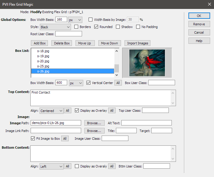
Global Options
Box Width Basis
Box Width Basis allows you to set a suggested width for all of the boxes in your grid. The Width Basis can be set in pixels or percentage. The default setting is 150px. Remember that Flexbox is adaptive and flexible, using suggested widths, never fixed widths. While this might be a new concept for you, it is how the spec is intended to work, and rendered grids are the closest thing to CSS art that we've ever seen.
Width Basis by Image
This option can be helpful when you are using your grid to display large images, in varying shapes. This option can be a real timesaver if you are given a folder of large, different shaped images by a client, and you do not have time to optiize or resize them.
Style Options
Style your boxes globally. These options will affect all boxes in your grid, but can be easily overridden for individual boxes.
-Colors
Choose from several different preformatted colors for your grid's boxes.
-Box Styles
Set Borders, Rounded Corners, Shadows, or Disable Padding
-User Class
You can assign an optional global User Class This class will be assigned to your grid's root container. You can also add multiple classes . To do so, enter each class name separated by a space.
Box List

The Box List is a list of all the boxes that comprise your grid. If you opt to insert an image, the listing will be the file name of your image. If your box is comprised of content, then the first 60 or 70 characters will display instead.
Use the Add, Delete, and Move buttons to add, remove, or re-order boxes. The Import Images button opens an import facility that enables you to quickly and easily populate your grid with images imported from a folder within your local site.
Import Images
Click the Import Images button to open the Select Image Folder...
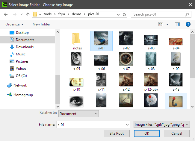
Select the first image in the folder and click OK to open the Import Image Import dialog...
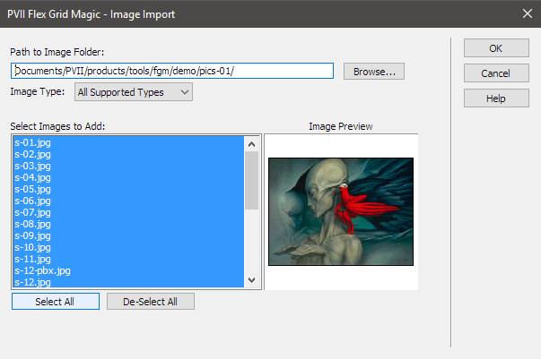
Images can be selected individually (CTRL Select or Shift Select) or you can simply click the Select All button to select all images.
Click OK to finish the import. You will be returned to the main FGM UI, with your newly imported images showing in the Box List.
Box Options
Directly under the Box List are the options available for individual boxes.

With a box selected in the list, you can set a Box Width Basis that will override you global setting.
Vertical Center
You can set your selected box to Vertical Center, and if you click the handy All button, the UI will automatically set every box in your list to Vertical Center.
User Class
You can assign an optional User Class to the selected box. You can also add multiple classes . To do so, enter each class name separated by a space.
Content and Images
What goes inside an FGM box can include Top Content, an Image, and Bottom Content. Each component can be assigned specific, targeted options.
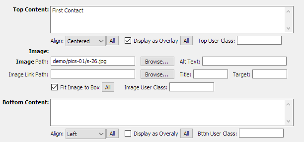
Top and Bottom Content
Using both Top and Bottom Content is meaningful if your box also contains an image, and you wish a caption above the image and additional information below.
Top and Bottom Content boxes accept simple text or valid HTML markup.
If your content is to be simple text, simply type it into the box. If your content will be more varied in nature, then you can add one or more placeholder words in the box. When your grid is built, the content areas inside your boxes are easily editable in Dreamweaver Design View.
The Top and Bottom Content input boxes each contain an identical set of targeted options:
Align
Align the content inside center, left, or right. There is a handy All button available for this option. This button will assign your selected alignment option to the content areas in every box in your list.
Display as Overlay
Absolutely position the content in a semi-transparent DIV, at either the top or bottom of the grid box. This option also has an associated All button.
Top (or Bottom) User Class
You can assign an optional User Class to the content area. You can also add multiple classes . To do so, enter each class name separated by a space.
Image
The following options are available...

Image Path
You can use this box, and ts associated Browse button, to set the path for an image in a newly added box, or to change the path of an existing image (even if that image was originally imported).
Alt Text
Optionally assign Alt Text to the image's tag. If none is assigned, we will place an empty Alt attribute on your image's tag.
Image Link Path
Assign a hyperlink to your image. You can also do this in Design View,
Title
Set a Title attribute on the <a> tag assigned to your image.
Target
Set a target to set the link you assigned to your image to open in a new window or tab.
Fit Image to Box
This is a very cool option! If you check the box, your image's path will be detected by the FGM script, triggering a routine that will hide the embedded image, while setting it as a background image that completely fills your grid box, edge to edge. This option comes with an All button—when clicked it will assign this option to all boxes in your grid.
Image User Class
You can assign an optional User Class to the fgm-img DIV surrounding your image. You can also add multiple classes . To do so, enter each class name separated by a space.
CSS Editing
Flex Grid Magic links a single style sheet to your page: p7FGM-01.css
Given the options available in the user interface, there should never be a reason for you to edit the styles. Should you need help with CSS, and you cannot figure it out, please contact us via one of the methods listed below.
Support Options
Before making a support inquiry, please be certain to have read the documentation that came with your product. Please include your Order Number, Dreamweaver version, as well as your computer operating system type in all support correspondence.
Support Forum
PVII maintains a Web Forum community. Go Direct to the Web Forum
E-Mail and Phone Support
E-Mail: support@projectseven.com
Phone: (336) 374-4611
Phone hours are 9:00am - 5:00pm Eastern Time U.S.