main features
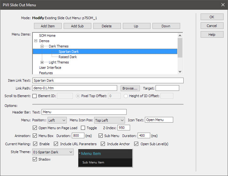
Responsive and Adaptive...
Your Slide Out menu will display perfectly on all devices—desktops, laptops, smartphones, and tablets!
Intuitive and Unobtrusive...
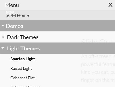
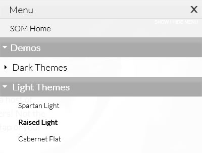
If you're concerned that your less tech-savvy visitors may not find your menu, simpy set your menu to open on page load. Your visitors will clearly see where the menu is, and how it works. If that's not enough, you can also add a label below the hamburger icon! And when not needed, your menu is easy to move off-screen, out of the way. More room for your content!
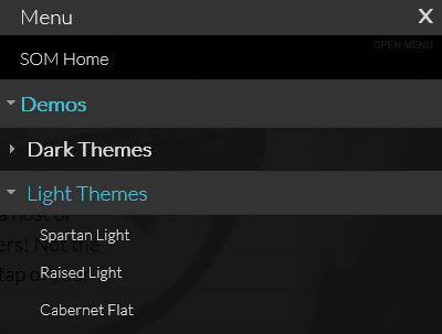
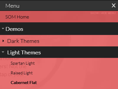
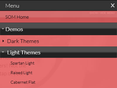
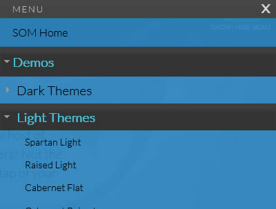
Unlimited Sub-Menu Levels...
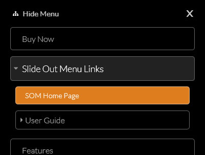
Slide-Out menu supports an unimited number of sub-menu levels, making it a modern take on the classic tree menu.
Smooth Scroll to Same Page Links...
Slide Out Menu features a Scroll to Element feature, allowing you to scroll smoothly to any section of your page. You can also employ a Scroll to Element behavior with a conventional hyperlink to another page. The new page will load, and smoothly position itself at your target element.