Pop Menu Magic 3 Style GuideFrom PVII: the leader in responsive Dreamweaver tools
Pop Menu Magic 3 is the first auto-responsive multi-level menu system for Dreamweaver.
The PMM3 Style Guide
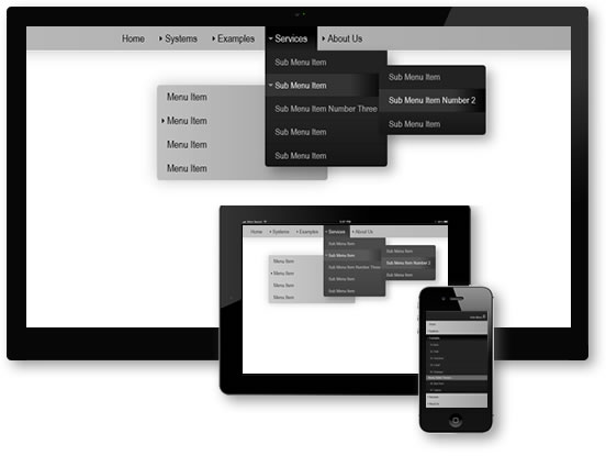
For this guide we are going to examine the PMM3 Theme 6 (Blue Pearl) CSS file: p7PM3-06.css which is representative of all the available themes. Here is an example Blue Pearl menu for reference:
Note: PMM3 uses a single CSS file for each theme—covering all three menu modes: Horizontal, Vertical, and Smartphone.
.p7PM3-06
line-height: 1;
font-family: "Arial Narrow", Arial, sans-serif;
font-size: 18px;
font-stretch: condensed;
background: linear-gradient(180deg, rgba(205,175,168,1), rgba(172,118,104,1));
background-color: #C19C93;
border-bottom: 1px solid #000;
-webkit-transform-style: preserve-3d;
This is the root PMM3 container. We use a container to make it easy for you to align the menu. The background is set with a CSS linear gradient that begins with color rgba(205,175,168,1) (light sand) and ramps to rgba(172,118,104,1) (medium sand). The gradient direction is set to 180 degrees, which ramps the colors from top to bottom. A background color that falls between the starting and ending gradients is set as a fallback for old browsers. If you change the font-family from Arial Narrow, you will probably want to reduced the font-size to less than 18px and also remove the font-stretch property.
The "-webkit-transform-style: preserve-3d" declaration is a hack to fix a bug in Safari browsers that sometimes causes a flickering effect when animating elements with CSS level 3 methods.
.p7PM3-06.horiz
padding: 0px 8px;
This is the root PMM3 container for horizontal menus. Left and right padding is set to 8px.
.p7PM3-06.horiz ul div
padding-top: 16px;
background-color: rgba(255,255,255,0);
The PMM3 script dynamically creates an advanced structure beyond the actual HTML markup you see in your page code. This advanced structure includes DIVs that can be used to provide positioning options. In this rule, the top padding provides vertical separation between the root level of a horizontal menu and its first sub-menu when you use Theme 6 (Blue Pearl). The background color is set to white with full alpha transparency. This is to ensure that your sub-menu will not accidentally close if your cursor wanders into the area defined by the padding.
.p7PM3-06.horiz ul ul div
padding-top: 0px;
For third-level menus (in a horizontal menu, these would be the levels that fly out) we turn off the top padding that we set for the first sub-level in the previous rule.
.p7PM3-06.horiz.open_up
border-top: 1px solid #000;
border-bottom: none;
In a horizontal menu, when the option is set to open sub-menus upward, we want to assign a top border to the root structure and remove the bottom border.
.pmm3-toolbar (do not edit)
display: none;
The toolbar is what appears above the menu in smartphones. This is hidden by default and appears via a rule in the smartphone media query when the browser or device width is 700 pixels or less.
.p7PM3-06.rounded
border-radius: 0px 0px 0px 0px;
If you are deploying your menu in a scenario where it is not full browser width, this rule will enable you to quickly add rounded corners to any or all sides of the root menu. The order of the values is: Top Left, Top Right, Bottom Right, Bottom Left.
.p7PM3-06.shadows
border-bottom-color: #FFF;
box-shadow: 0px 0px 60px rgba(0,0,0,.3);
When the Outer Shadow option is selected in the PMM3 interface, this rule assigns a shadow and complementary bottom border to the root menu structure.
.p7PM3-06 a img (do not edit)
border: none;
vertical-align: bottom;
When an image is also a link, some browsers will draw a border around the image. This rule ensures that will not happen. When using strict or HTML 5 DOCTYPEs, images align to the text baseline, leaving a slight gap below (for character descenders). Setting vertical-align to bottom prevents the gap.
.p7PM3-06.menu-centered (do not edit)
text-align: center;
Centers a horizontal menu based on your choice of alignment in the meu interface.
.p7PM3-06.menu-right (do not edit)
text-align: right;
Right aligns a horizontal menu based on your choice of alignment in the meu interface.
.p7PM3-06:after (do not edit)
content: "\0020";
clear: both;
font-size: 0px;
line-height: 0;
display: inline;
height: 0px;
This rule serves to clear the floated elements inside the menu.
.p7PM3-06 ul (do not edit)
margin: 0px;
padding: 0px;
display: inline-block;
vertical-align: bottom;
The menu UL element is displayed as an inline block, which permits the menu to be easily aligned using the text-align property on the . or . classes that the interface assigns when you choose an alignment option other than left. In HTML5, inline or inline-block elements sit above the text baseline so we use vertical-align bottom to remove unwanted whitespace below the menu.
.p7PM3-06 ul li (do not edit)
list-style-type: none;
float: left;
position: relative;
The root menu list items. This class defines the essential menu structure.
.p7PM3-06 ul li a
display: block;
padding: 12px 18px;
color: #000;
text-decoration: none;
font-size: 1em;
background-repeat: no-repeat !important;
background-position: left center !important;
This rule defines the root level links.
.p7PM3-06 a.trig_closed
background-image: url(img/pmm3-right-dark.gif);
This rule targets the root trigger links when their sub-menu(s) are closed by assigning an arrow background image.
.p7PM3-06 ul ul a.trig_closed
background-image: url(img/pmm3-right-dark.gif);
This rule targets the sub-menu trigger links when their sub-menu(s) are closed by assigning an arrow background image. It exists as a separate class to allow you to make changes that target only the sub-level.
.p7PM3-06 a.trig_open
background: url(img/pmm3-down-dark.gif), linear-gradient(90deg, rgba(172,118,104,0), rgba(172,118,104,1));
This rule targets the root trigger links when their sub-menu(s) are open by assigning 2 background attributes (separated by a comma): an arrow and a linear gradient.
.p7PM3-06 a.root_link:hover
linear-gradient(90deg, rgba(172,118,104,0), rgba(172,118,104,1));
The root_link class is programmatically assigned to root links that are not triggers. In other words, links that do not have related sub-menus. This class assigns a linear gradient on hover.
.p7PM3-06 ul ul li a.trig_open
color: #000;
background-color: #B08377;
url(img/pmm3-down-dark.gif), linear-gradient(90deg, rgba(172,118,104,0), rgba(172,118,104,1));
This rule targets sub-menu trigger links when their sub-menu(s) are open. We assign a text color, a background-color (for old browsers) and use the background property to assign both an arrow image and a linear gradient.
.p7PM3-06 ul ul li a.pm3-link:hover
color: #000;
background-color: #B98E84;
none, linear-gradient(90deg, rgba(172,118,104,0), rgba(172,118,104,1));
The pm3-link class is programmatically assigned to all links that are not triggers. Prefacing the class with ul ul li targets only those elements in the sub-menus. When such links are hovered, we assign a text color, a background-color (for old browsers) and use the background property to remove the background image arrow and to assign a linear gradient.
.p7PM3-06 ul ul
background: linear-gradient(180deg, rgba(255,255,255,1), rgba(221,221,221,1));
background-color: #DDD;
display: block;
text-align: left;
width: 200px;
The sub-menu UL element. We assign a linear gradient and a background-color (for old browsers). Do not edit the display or text-align properties. Width is set to be the default width should you deselect the default Auto Sub Menu Width option in the interface. If you turn off the Auto Sub Menu Width option, the width set in this rule will become active. You can then edit it to any value you wish to use.
.p7PM3-06.transparent ul ul
background: linear-gradient(180deg, rgba(255,255,255,.92), rgba(221,221,221,.92));
The sub-menu UL element when the Sub Menu Transparency option in the menu UI has been selected. When using RGBA colors, the last value is the Alpha value, which is used to set a transparency level—in this case .92 (1 is fully opaque and 0 is fully transparent).
.p7PM3-06.shadows ul ul
box-shadow: 0px 0px 10px rgba(0,0,0,.75);
The sub-menu UL element when the Outer Shadow option in the menu UI has been selected.
.p7PM3-06.auto-subs ul ul (do not edit)
width: auto;
When the default Auto Sub Menu Width option in the interface is on, sub-menu width is set to auto by this class.
.p7PM3-06.auto-subs ul ul li a (do not edit)
white-space: nowrap;
When the default Auto Sub Menu Width option in the interface is on, the sub-menu link items are set to not wrap. This allows the sub-menu width to be based on the longest menu item. If you have unusually long menu items that force your sub-menu to be too wide, simply turn off the Auto Sub Menu Width option. Your menus will then be set to 200px (an editable value in the .p7PM3-06 ul ul rule) and menu items longer than that value will wrap to a new line.
.p7PM3-06 ul ul li (do not edit)
position: relative;
float: none;
margin: 0px;
padding: 0px;
Structural rules for the sub-menu list items.
.p7PM3-06 ul ul li a
border: none;
color: #000;
font-size: .9em;
padding: 10px 18px;
Sub-menu link items.
.p7PM3-06 ul ul li:last-child a
border-bottom: none;
We turn off the bottom border for the last menu item.
Rules for Rounded Corner Option
Do not edit
.p7PM3-06.rounded ul ul,
.p7PM3-06.rounded ul ul ul (do not edit)
border-radius: 5px;
.p7PM3-06.rounded ul a.root_trig,
.p7PM3-06.rounded ul a.root_link (do not edit)
border-radius: 0px;
.p7PM3-06.rounded ul ul a.pm3first,
.p7PM3-06.rounded ul ul .pm3first.pmm3-title-bar (do not edit)
border-radius: 5px 5px 0px 0px;
.p7PM3-06.rounded ul ul a.pm3last,
.p7PM3-06.rounded ul ul .pm3last.pmm3-title-bar (do not edit)
border-radius: 0px 0px 5px 5px;
.p7PM3-06.rounded ul ul a.pm3first.pm3last (do not edit)
border-radius: 5px;
.p7PM3-06.rounded ul a.root_trig.trig_up (do not edit)
border-radius: 5px;
.p7PM3-06.rounded li.trig_up div (do not edit)
padding-bottom: 10px;
.p7PM3-06.rounded ul ul li.trig_up div (do not edit)
padding-bottom: 0px;
.p7PM3-06.rounded .trig_up a.pm3first (do not edit)
border-radius: 5px 5px 5px 5px !important;
.p7PM3-06.rounded ul li.trig_up ul (do not edit)
border-radius: 5px 5px 5px 5px;
.p7PM3-06.rounded .trig_up .pm3first.pmm3-title-bar (do not edit)
border-radius: 5px 5px 0px 0px !important;
.p7PM3-06.rounded .trig_up .pm3last.pmm3-title-bar (do not edit)
border-radius: 0px 0px 5px 5px !important;
.p7PM3-06.vert.rounded
border-radius: 5px;
Display as Title Only
You can optionally set any item in your menu to display as a title rather than a link. Menu items set to this option are no longer links. They can be used instead to break down a sub-menu into different sections or to include a marketing message.
.p7PM3-06 .pmm3-title-bar
padding: 12px 18px;
color: #DDD;
background: linear-gradient(90deg, rgba(72,72,72,1), rgba(0,0,0,1));
background-color: #222;
Use this rule to set specific padding and colors for your title.
.p7PM3-06.auto-subs ul ul .pmm3-title-bar (do not edit)
white-space: nowrap;
Image Links (do not edit)
The following rules style your menu items when you use images instead of text.
.p7PM3-06 .p7PM3_img
border: none;
padding: 0px;
text-align: center;
background: none !important;
.p7PM3-06 .p7PM3_img img
border: none;
width: auto !important;
height: auto !important;
max-width: 100%;
vertical-align: bottom;
Vertical Menu Rules
The following rules apply only to menu's that are set to display vertically.
.p7PM3-06.vert
border: none;
background: linear-gradient(180deg, rgba(255,255,255,1), rgba(221,221,221,1));
background-color: #DDD;
The root menu for vertical mode menus.
.p7PM3-06.vert ul div (do not edit)
padding-top: 0px;
We disable any top padding for vertical menu DIVs.
.p7PM3-06.vert.shadows
box-shadow: 0px 0px 10px rgba(0,0,0,.5);
Shadow is set for the root if the shadow option is selected in the menu UI.
.p7PM3-06.vert ul (do not edit)
display: block;
The root and sub-menu UL elements in vertical menu mode are set to display block—as opposed to the inline-block setting needed for horizontal mode.
.p7PM3-06.vert ul li (do not edit)
float: none;
padding: 0px;
position: relative;
Vertical menus do not need to float.
.p7PM3-06.vert ul ul li (do not edit)
padding: 0px;
margin: 0px;
We turn off any padding or margins for the sub-menu LI elements.
Current Mark Rules
The current mark class is assigned to any link that matches the current page address. This allows that link to be highlighted to indicate to the visitor the page they are viewing with respect to the menu.
.p7PM3-06 ul li a.current_mark
text-shadow: -.5px 0px 0px #000;
We set a text shadow to simulate bold. By doing it this way, we eliminate the shift in menu width that occurs on page load as the system detects the current page link and changes it from normal to bold.
.p7PM3-06 ul ul li a.current_mark
text-shadow: none;
font-weight: bold;
We turn off text-shadow for sub-menu current marked links and we assign font-weight bold.
.p7PM3-06.vert ul li a.current_mark
text-shadow: none;
font-weight: bold;
We turn off text-shadow for all current marked links and we assign font-weight bold for vertical menus.
No Script Rules (do not edit)
The following rules enable your menu to work even when javascript is disabled in the browser. They should not be edited.
.p7PM3-06.p7PM3noscript {
position: relative;
}
.p7PM3-06.p7PM3noscript ul ul {
position: absolute;
display: none;
top: 100%;
}
.p7PM3-06.p7PM3noscript ul ul ul {
display: none;
top: 0px;
left: 100%;
}
.p7PM3-06.vert.p7PM3noscript ul ul {
top: 0px;
left: 100%;
}
.p7PM3-06.p7PM3noscript li:hover ul {
display: block;
}
.p7PM3-06.p7PM3noscript li:hover ul ul, .p7PM3-06.p7PM3noscript li:hover ul ul ul, .p7PM3-06.p7PM3noscript li:hover ul ul ul ul, .p7PM3-06.p7PM3noscript li:hover ul ul ul ul ul, .p7PM3-06.p7PM3noscript li:hover ul ul ul ul ul ul {
display: none;
}
.p7PM3-06.p7PM3noscript li li:hover ul, .p7PM3-06.p7PM3noscript li li li:hover ul, .p7PM3-06.p7PM3noscript li li li li:hover ul, .p7PM3-06.p7PM3noscript li li li li li:hover ul, .p7PM3-06.p7PM3noscript li li li li li li:hover ul {
display: block;
}
Breadcrumb Rules
The following rules style breadcrumb trails made using the optional PMM3 Breadcrumb command.
.p7PM3-06_crumbs.centered (do not edit)
text-align: center;
.p7PM3-06_crumbs.right (do not edit)
text-align: right;
.p7PM3-06_crumbs ul (do not edit)
margin: 0px;
padding: 0px;
overflow: hidden;
font-size: 1em;
display: inline-block;
.p7PM3-06_crumbs li (do not edit)
list-style-type: none;
display: block;
float: left;
margin-right: .25em;
The above breadcrumb rules define the structure of the breadcrumb elements and should not be edited.
.p7PM3-06_crumbs a
text-decoration: none;
color: #000;
The breadcrumb link element and its color, which is set to black (#000) by default.
.p7PM3-06_crumbs a:hover
text-decoration: underline;
The breadcrumb link element hover style. By default we are simply underlining the link. Feel free to add a color if you want.
.p7PM3-06_crumbs li:last-child (do not edit)
margin-right: 0px;
font-weight: bold;
We disable any right margin for the last link in the breadcrumb. We also make the last link bold as it will usually relate to the page you are on.
Breadcrumb separator characters (do not edit)
The following rules set separator characters in accordance with the separator option in the Breadcrumb UI. Do not edit the values.
content: "\0020 \0020 \27A7";
}
.p7PM3-06_crumbs.thin-arrow li:after {
content: "\0020 \0020 \279F";
}
.p7PM3-06_crumbs.open-arrow li:after {
content: "\0020 \0020 \21E8";
}
.p7PM3-06_crumbs.triangle-dots li:after {
content: "\0020 \0020 \2234";
}
.p7PM3-06_crumbs.double-colon li:after {
content: "\0020 \0020 \2237";
}
.p7PM3-06_crumbs.pipe li:after {
content: "\0020 \0020 |";
}
.p7PM3-06_crumbs.dash li:after {
content: "\0020 \0020 -";
}
.p7PM3-06_crumbs li:last-child:after {
content: "\0020";
}
Smartphone Menu Media Query
The following Media Query targets smartphones and narrow windows. These rules determine how the menu looks when it is reconfigered into a vertical accordion-type menu on small devices or in very narrow browser windows. Please limit yourself to color changes only—unless your CSS skills are fairly advanced.
@media only screen and (min-width: 0px) and (max-width: 700px)
.p7PM3-06.responsive:after (do not edit)
display: none;
.p7PM3-06.responsive .pmm3-toolbar (edit with care)
display: block;
background-color: #222;
padding: 10px;
text-align: right;
cursor: pointer;
The toolbar is the element that appears above the menu in small devices. This element contains a toggle icon, as well as optional text to allow a visitor to show or hide the menu. We set this element to display: block so that it is visible. We set a background-color, padding, text alignment, and a pointer cursor.
.p7PM3-06.responsive .pmm3-toolbar a (edit with care)
font-size: 2em;
font-weight: bold;
color: #999;
text-decoration: none;
The link items inside the toolbar. Font-size is set larger to properly display the character entity used for the icon.
..p7PM3-06.responsive .pmm3-toolbar a:hover
color: #09F;
The toolbar link element when hovered.
.p7PM3-06.responsive .toggle-text.closed a:before (edit with care)
content: "Show Menu \0020";
font-size: .5em;
If the Show Toggle Text option is enabled, you can use this rule to change the text that appears next to the icon when the menu is hidden. You can, for example, change the language.
.p7PM3-06.responsive .toggle-text.opened a:before (edit with care)
content: "Hide Menu \0020";
font-size: .5em;
Use this rule to change the optional text that appears next to the icon when the menu is visible. You can, for example, change the language.
.p7PM3-06.responsive (do not edit)
text-align: left !important;
padding: 0px !important;
border: none !important;
box-shadow: none !important;
The root menu in smartphone mode. We are turning off properties that should not ordinarily be used for this mode.
..p7PM3-06.responsive.horiz ul div,
.p7PM3-06.responsive ul (do not edit)
padding-top: 0px !important;
.p7PM3-06.responsive ul (do not edit)
display: block;
padding: 0px;
.p7PM3-06.responsive.vert ul (do not edit)
margin-top: 0px;
.p7PM3-06.responsive ul li (do not edit)
float: none;
margin-right: 0px;
.p7PM3-06.responsive ul ul li (do not edit)
padding: 0px;
.p7PM3-06.responsive a:hover (edit with care)
color: #DDD;
background-color: #333;
.p7PM3-06.responsive ul ul (do not edit)
position: static !important;
width: auto;
padding: 0px;
.p7PM3-06.responsive ul ul a (edit with care)
padding-left: 24px;
We assign a larger padding value to the sub-menu link items to create an indented-level look.
.p7PM3-06.responsive ul ul ul a (edit with care)
padding-left: 32px;
We assign a larger padding value to the third-level sub-menu link items to continue the indented-level look. You can add additional levels if you wish. The next level, for example, would be targeted with a selector name of .p7PM3-06.responsive ul ul ul ul a.
.p7PM3.responsive ul.closed (do not edit)
display: none;
.p7PM3.responsive ul.opened (do not edit)
display: block;
The above 2 rules work in conjunction with the toolbar icon (and optional text) to show and hide your menu.
.p7PM3.responsive.rounded * (do not edit)
border-radius: 0px !important;
Using the universal selector (denoted by the asterisk) we turn off rounded corners for all elements in the menu when it is in smartphone mode.
.p7PM3.responsive.shadows * (do not edit)
box-shadow: none !important;
Using the universal selector (denoted by the asterisk) we turn off shadows for all elements in the menu when it is in smartphone mode.
.p7PM3-06_crumbs (do not edit)
display: none;
We hide the breadcrumbs, by default, in smartphone mode. In most cases they would occupy too much valuable space and would not really be helpful for smartphone users. You can override this rule by choosing the Show Breadcrumbs in Mobile Mode option in the Breacrumb UI.
.p7PM3-06_crumbs.show-mobile (do not edit)
display: block;
Shows the breadcrumb trail in smartphones when the Show Breadcrumbs in Mobile Mode option is enabled in the Breacrumb UI.
..p7PM3-06.responsive .pmm3-title-bar (edit with care)
padding: 12px 18px !important;
Provides padding for menu items set to Display as Title Only.
This document will evolve to include additional information. If there is anything you are unsure about please do not hesitate to ask for support. PVII Support Home...
Editing and determining RGBA colors
The following procedures will enable you to convert HEX colors to RGBA in Dreamweaver CS5 and under. Dreamweaver CS5.5 and up have native support for RGBA built in.
RGBA stands for Red-Green-Blue-Alpha. Each value is separated by a comma. The alpha value allows you to set a transparency level for the element being colored—be it a background color, a text color, or a border color. White (255, 255, 255) and black (0, 0, 0) are easy. Dreamweaver can help you to determine the RGB values using its standard color picker tool.
In your CSS Styles panel, select the rule you want to edit. Start by assigning a Hex color. Let's say #6C6. Open the color picker. Then click the System Color Picker icon:
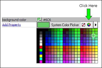
The System Color Picker will open:
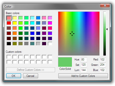
Your RGB numbers are listed as the Red, Green, Blue values: 102, 204, 102. So change your color value to:
rgba(102,204,102,1);
Remember, the "1" at the end is the alpha value and means your color is fully opaque (no transparency). To set transparency, choose a decimal value between 1 and 0. For example, to set 50% transparency, your values would be:
rgba(102,204,102,.5);