Quick Grid Magic -Tutorials A CSS Grid Builder for Dreamweaver
Buy Now | QGM Home | User Guide | Tutorials
Creating a Custom Style Theme
Custom Styling Best Practices
Any customization style rules are best kept in a separate CSS file so they can be more efficiently managed. Be sure to follow the QGM Best Practices recommendations on the main QGM Tutorials page.
Custom Style Themes
While the QGM system includes 30 color presets that you can choose in the user interface for both the columns (cells) and the container, you may need to perfectly match an existing site's color theme, or you may simply want to create your own special styling. This tutorial will show you how to create a custom style theme that can you apply to the QGM grid.
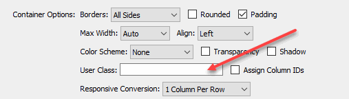
User Class
The User Class option provides a handy way to assign custom styling to the grid.
We'll create a custom user class style rule that will assign our special styling.
Create the theme style rules
As an example, we'll create a custom style theme named spearmint that is designed to match a site's specific green colors. Of course, you can use any name and any colors that makes sense to you.
-Create these four style rules in your exception style sheet:
.p7QGM.spearmint {
	background-color: #d9ffdc;
	color: #34bd3e;
}
.p7QGM.spearmint.qgm-pad {
    padding: 15px;
}
.p7QGM.spearmint > .qgm-grid > .qgm-col {
	background-color: #ceefe4;
	color: #1c6121;
	border-color: #34bd3e;
}
.p7QGM.spearmint .qgm-grid.qgm-gap {
    gap: 6px 10px;
}
These rules define the custom green spearmint colors and also adjust the padding and gap for the grid. We'll go into detail on each rule later on.
-Save the style sheet.
Create the Grid
-Click in the area on the page where you want your grid.
-Open the QGM user interface.
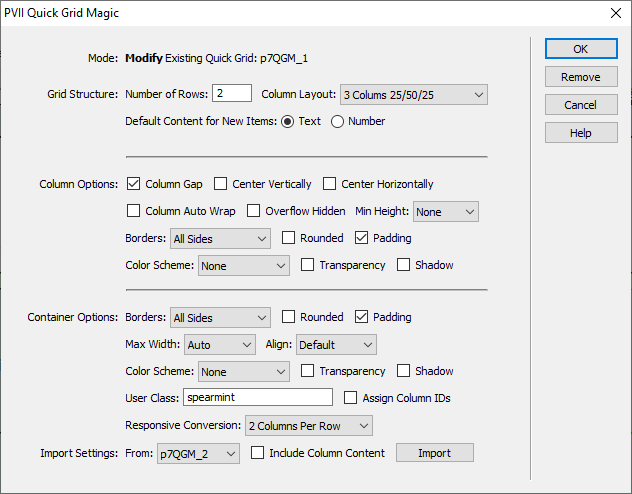
-Set the Number of Rows to 2.
-Set the Column Layout to 3 Columns 25/50/25.
-Select None in the Color Scheme selection in the Column Options section.
-Select None in the Color Scheme selection in the Container Options section.
-Enter the name of our theme, spearmint, into the User Class box.
-Click OK to close the interface and build the grid onto your page.
-Now preview the page.
Column 1
Lorem ipsum dolor sit amet, consectetuer adipiscing elit, sed diam nonummy nibh euismod tincidunt ut laoreet dolore magna aliquam erat volutpat.
Column 2
Lorem ipsum dolor sit amet, consectetuer adipiscing elit, sed diam nonummy nibh euismod tincidunt ut laoreet dolore magna aliquam erat volutpat.
Column 3
Lorem ipsum dolor sit amet, consectetuer adipiscing elit, sed diam.
Column 4
Lorem ipsum dolor sit amet, tincidunt ut laoreet dolore magna aliquam erat volutpat.
Column 5
Lorem ipsum dolor sit amet, consectetuer adipiscing elit, sed diam nonummy nibh euismod tincidunt ut laoreet dolore magna aliquam erat volutpat.
Column 6
Lorem ipsum dolor sit amet, consectetuer adipiscing elit, sed diam nonummy nibh euismod tincidunt ut laoreet dolore magna aliquam erat volutpat.
The Theme Style Rules
This section provides the detail for each style rule. Ordinarily you will only need the first two, the container and column style rules, to provide theme styling. We added the padding and column gap rules to illustrate how other styling attributes can be combined into the theme.
Container Styling
This rule assigns any special styling to the outer container for the grid.
.p7QGM.spearmint {
	background-color: #d9ffdc;
	color: #34bd3e;
}
We set the background color to a light green and set the text color to bright green. We're not using any text in the container but the border will automatically use this color. You can use this rule to assign any other special styling for the container.
Column Styling
This rule assing the special styling for all of the columns (cells) in the grid.
.p7QGM.spearmint > .qgm-grid > .qgm-col {
	background-color: #ceefe4;
	color: #1c6121;
	border-color: #34bd3e;
}
We set the column background color to a minty green, the text color to a dark green. We also assigned a special light green border color to provide accent to each column. You can use this rule to assign any other special styling for the columns.
By assinging only the border-color, as opposed to a full border rule, we can still use the QGM interface to turn borders on or off.
Column Gap Settings
This rule assigns the vertical and horizontal column gap properties. You can still use the QGM interface to trun the gap on or off.
.p7QGM.spearmint .qgm-grid.qgm-gap {
    gap: 6px 10px;
}
We set a shorter vertical gap between the rows, only 6px, and set the gap between the columns to the default 10px.
Container Padding
This rule assings the amount of padding between the outer borders and the column edges. Using this syntax you can still use the QGM interface to turn the padding on or off.
.p7QGM.spearmint.qgm-pad {
    padding: 15px;
}
We set a larger padding amount, 15px, to provide more offset from the outer continaer borders to the columns.
PVII tools make Dreamweaver better.