HTML Toolkit: Responsive Images User Guide
Installing the Responsive Images Toolkit
Extension installer files come in 2 formats: MXP and ZXP. MXPs are supported by Extension Manager versions MX, MX2004, 8, CS3, CS4, CS5, CS5.5 and CS6. ZXP is supported by versions CS5.5 and higher. To install this product, open your Adobe Extension Manager, click the Install icon or link, and then browse to where you unzipped the installer file.
Dreamweaver CC 2015 (and higher) Extension Installation Information
As of CC 2015, Adobe has ceased to support its own Extension Manager. Use the PVII Extension Manager for Adobe Creative Cloud:
PVII Extension Manager for Adobe CC
( Windows and Mac)
Overview
Two tools in one! In its simplest aspect, the Responsive Images Toolkit allows you to quickly insert responsive, scalable images and optionally style them with rounded corners, borders, and even shadows. For the connoisseur of modern CSS, however, it is so much more. The UI also allows you to use the HTML5 picture tag and SRCSET Attribute, giving you a means to serve separate images based on the viewing device's viewport size. The viewing device (desktop/laptop/phone/tablet) will download and display only the image that meets the criteria you set in the toolkit's UI, thereby saving bandwidth in the most efficient way possible.
Dreamweaver Extended...
The PVII Responsive Images Toolkit is a productivity tool that enables you to manage the most important aspects of your site's images— from inserting them, to styling them, to making them responsive—all from the comfort and safety of an intuitive user interface—with absolutely no coding required. Like all PVII tools, the Responsive Images Toolkit makes Dreamweaver better: better than Bootstrap, better than online web site builders, better than Dreamweaver is without it.
The PVII Difference
PVII HTML Toolkits and Page Builders are made to allow Dreamweaver users to leverage the power of modern CSS and HTML methods without having to learn a new application, and without having to know code. Whether you are are a web design novice, or a master of CSS, PVII tools make your life easier and your time more productive. No other Dreamweaver extensions or plugins, and no feature that comes with Dreamweaver, can even compare.
Accessing the Responsive Images Toolkit UI
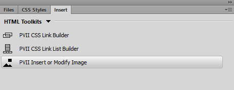
Installing the Responsive Images Toolkit creates a new category on your Insert Bar/Panel called HTML Toolkits (the last category in the screen captures below):
Insert Bar
![]()
The HTML Toolkit tab's icons depend on which toolkits you have installed. The third icon in the above image opens the Responsive Images Toolkit UI. The first two icons open the CSS Link Builder and CSS Link List Builder UIs.
Insert Panel
Insert Menu
Alternatively, you can use the traditional Insert Menu. Choose:
Insert > PVII HTML Toolkits > PVII Scalable Image
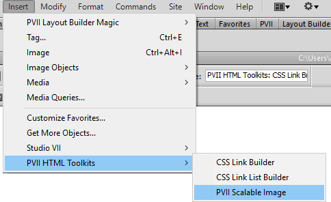
The interface will open...
The Responsive Images Toolkit UI
Mode
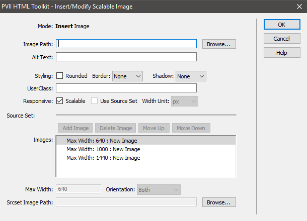
There are 2 modes: Insert Image and Modify Image
Note: One of the things that makes PVII Extensions unique is the ability to not just insert code, but to modify the code (and options) you insert as many times as you need to. In that sense, we add a level of automation to Dreamweaver that it ordinarily does not have.
The Modify Mode UI
To access the Modify UI, select the relevant image on your page and use the Insert Bar or Insert Menu, just as you did to open the UI initially.
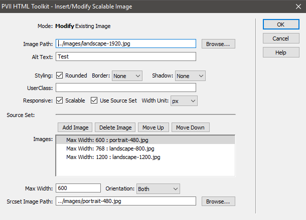
Image Path
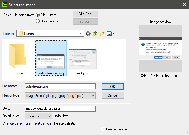
Your first step in creating a responsive image is to enter the image's path. Use the Browse button to select an image. The image can already reside in a folder within your defined local site, or anywhere else on your hard drives.
A simple image selection dialog will guide you:
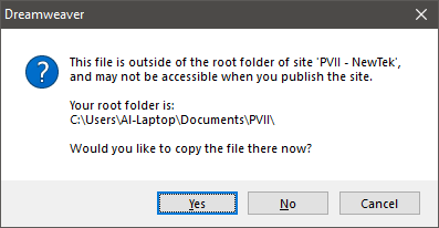
If the image is not within your local Dreamweaver site, a dialog box will appear, giving you the opportunity to save a copy of the image in any folder within your Dreamweaver site.
Alt Text
Alt Text is a W3C Attribute that is required in order to meet basic accessibility standards. Alt Text should be limited to simple text that concisely describes the images to search engines and to visually impaired visitors using assistive readers. If the image is strictly decorative an empty Alt Text string can be used so that your page passes validation tests, since the Alt Text attribute is required. Simply leave the box blank.
Styling Options
Choose from Rounded, Border (Light or Dark), and Shadow (Light or Dark), in any combination.
User Class
Easily assign a custom class to your image. Advanced CSS Authors can set one or more custom classes on the image, enabling them to set attributes and behaviors beyond the available UI options.
Note: Do not enter a leading period in the User Class box. If you are entering multiple classes, separate each one with a space. Do not use the characters p7 or tki, or tkl in your user class names.
Responsive
These options determine how your image responds to different devices and viewport sizes.
Scalable
This option is selected by default, and will cause your image to react to the width of the device or the browser window. Images will scale down, proportionally, and scale up, but will never exceed their natural width.
Use Source Set
The Source Set option, when enabled, allows you to set specific images to be loaded by various devices, based on viewport width, and orientation.
Width Unit
Choose between the default px (pixels), em, or rem.
Command Buttons
The Command buttons above the Source Set Images list allow you to Add images, Delete images, Move them Up, or Move them Down.

Images List
The default list of images contain three sample size queries. The default Width Unit is pixels, and unless you have a very specific reason, it should remain so.
Max Width
Each image in the list is assigned (by you) a max width, which tells the device at which width (or below) to load the associated image. When building your list, always begin with the smallest width and work upward.
Orientation
Tell the browser to serve a particular image based on both a max width and the device orientation: Portrait, Landscape, or Both.
Srcset Image Path
Browse to the image you wish to load.
Using Source Set: Tips
When using the Source Set option, the Toolkit UI will create a picture tag. The code will look something like this:
<picture>

<source media="(max-width: 768px)" srcset="../../leaderboard/image-768.jpg">

<source media="(max-width: 1000px)" srcset="../../leaderboard/image-1000.jpg">

<source media="(max-width: 1400px)" srcset="../../leaderboard/image-1440.jpg">

<img src="../../leaderboard/image-1920.jpg" width="1920" height="480" class="TKi tki-scalable tki-rnd" alt="">

</picture>
When adding content below the picture tag, Dreamweaver design view can get confused. If there are no existing paragraphs surrounding the picture tag, and you use your Enter key in design view to create a new paragraph, Dreamweaver could surround the img tag with a new paragraph and place another new paragraph inside the closing picture tag, like this:
<picture>
<source media="(max-width: 768px)" srcset="../../leaderboard/image-768.jpg">
<source media="(max-width: 1000px)" srcset="../../leaderboard/image-1000.jpg">
<source media="(max-width: 1400px)" srcset="../../leaderboard/image-1440.jpg">
<p><img src="../../leaderboard/image-1920.jpg" width="1920" height="480" class="TKi tki-scalable tki-rnd" alt=""></P>
<p> </p>
</picture>
If you wind up in such a predicament, place your cursor inside one of the source tags, or the img tag, and open the Responsive Image Toolkit UI. Simply click OK and we will repair the code for you.
Best Practice
To avoid problems, the best workflow when needing to add a paragraph below a picture tag is to do so in Code View. Let's look at the example code again:
<picture>

<source media="(max-width: 768px)" srcset="../../leaderboard/image-768.jpg">

<source media="(max-width: 1000px)" srcset="../../leaderboard/image-1000.jpg">

<source media="(max-width: 1400px)" srcset="../../leaderboard/image-1440.jpg">

<img src="../../leaderboard/image-1920.jpg" width="1920" height="480" class="TKi tki-scalable tki-rnd" alt="">

</picture>
Add your paragraph on a new line below the ending </picture> tag:
<picture>

<source media="(max-width: 768px)" srcset="../../leaderboard/image-768.jpg">

<source media="(max-width: 1000px)" srcset="../../leaderboard/image-1000.jpg">

<source media="(max-width: 1400px)" srcset="../../leaderboard/image-1440.jpg">

<img src="../../leaderboard/image-1920.jpg" width="1920" height="480" class="TKi tki-scalable tki-rnd" alt="">

</picture>

<p>My new paragraph</p>
Now you can proceed using your regular workflow in either Design or Code Views.
Advanced Topic:
About Pixel Density...
Pixel density is often discussed in concert with responsive design, but is really something quite unto itself. It simply means that if your screen has a pixel density of 2, a 500 pixel wide image, optimized in Photoshop or Fireworks, will be upsized to 1000 pixels—viewport width permitting. But you must remember, the viewport will still be 500 pixels wide. So, in order to display the maximum number of supported pixels, your images will need to be twice as wide, which will use significantly more bandwidth. It's similar to your HD television upsizing a 1080i data stream to 1080p. The image is going to show more detail, but the perceived improvement is not going to be easy to discern, and the benefits need to be weighed against the increase in file size and download time. So, our toolkit focuses on the methods that will gain you the most advantage, the most efficiency, and the minimum amount of bandwidth usage—an approach based on practicality.
Command Buttons

OK
Commit the options you have set in your UI session to the page and close the UI.
Cancel
Discard the options you have set in your UI session and close the UI. Nothing on the page will be changed.
Help
Load this User Guide in your default browser.
Note: Requires a live Internet connection.
Support Options
Before making a support inquiry, please be certain to have read the documentation that came with your product. Please include your Order Number, Dreamweaver version, as well as your computer operating system type in all support correspondence.
Support Forum
PVII maintains a Web Forum community. Go Direct to the Web Forum
E-Mail and Phone Support
E-Mail: support@projectseven.com
Phone: (336) 374-4611
Phone hours are 9:00am - 5:00pm Eastern Time U.S.
©2018 Project Seven Development