TPM3 Parallax AnimationThis Tutorial requires TPM3 version 3.2.1 or higher
Fast Track
We've prepared a folder so that you can complete a finished page in a few minutes. Download the folder, unzip it, and place it inside a defined Dreamweaver site.
Download parallax-tutorial folder
The Process
Open finished-page.htm
Place your cursor on the page and open the TPM3 interface.
Add three panels and configure your options as depicted in the screen capture below, making sure that you configure the Content Layout for each of the 3 panels as Default.
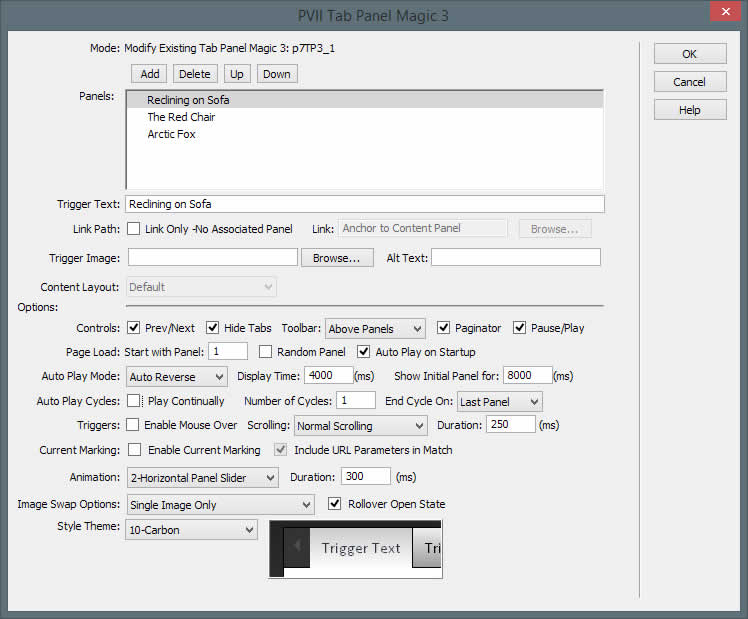
Make sure you select Animation 2 and Theme 10 (Carbon).
Click OK.
Add Text Boxes
Replace the boilerplate text in each panel with a short blurb to describe the image...limiting yourself to a single paragraph. When you are done typing, switch to Code View and locate your pragraph:
<p>This is your blurb text. Limit it to one paragraph.</p>
Wrap the paragraph inside a DIV tag and assign the blurb class to the DIV:
<div class="blurb">
  <p>This is your blurb text. Limit it to one paragraph.</p>

  </div>
That's it!
Design Time CSS
The finished-page.htm file is attached to a Design Time style sheet (dt.css). This style sheet is read only by Dreamweaver and its properties are only executed in Dreamweaver Design View. The Design Time CSS is not read by browsers and does not need to be uploaded. The purpose of this CSS file is to make the text box inside your panels accessible for editing in Dreamweaver's Design View. For more info on Design Time CSS, see this tutorial.
The CSS Custom Rules Defined
The following style rules are all it takes:
.p7TP3-10 {

border: none;

box-shadow: none;

border-radius: 5px;

}
The above rule Turns off borders and shadows on the root widget... and adds rounded corners.
.p7TP3-10 .p7TP3cwrapper_10 {border: none;}
Turns off borders on the content wrapper
.p7TP3_content_10 {

      background-repeat: no-repeat;

      background-position: 50%;

      background-size: cover;

      }
The above rule sets background attributes for the content panels.
Background-size ensures that the images fill the panel completely and background-position centers the images horizontally and vertically.
#p7TP3c1_1 { background-image: url(art/art-01.jpg); }

      #p7TP3c1_2 { background-image: url(art/art-02.jpg); }

      #p7TP3c1_3 { background-image: url(art/art-03.jpg); }
The above rules set the background image for the first 3 content panels, using the IDs genrerated by the TPM3 interface.
.p7TP3-10 .p7TP3-10-arrows a {opacity: .75;}
The above rule makes the previous and next arrows a little darker than normal in their default state.
.p7TP3_vp,

      .p7TP3cwrapper_10,

      .p7TP3_content_10 {

      border-radius: 5px;

      }
The above rule rounds the corners of the content area.
.blurb {

      max-width: 40%;

      margin: 5% 0px 5% 100px;

      padding: 36px;

      background-color: #222;

      background: rgba(0,0,0,.6);

      border-radius: 6px;

      color: #DDD;

      }
The overlay is simulated using max-width and margins. Transparency is set using RGBA colors with a transparency of .6... while background color is set as a fallback for old browsers.
#p7TP3c1_1 .blurb {background-color: rgba(0,0,0,.6);}
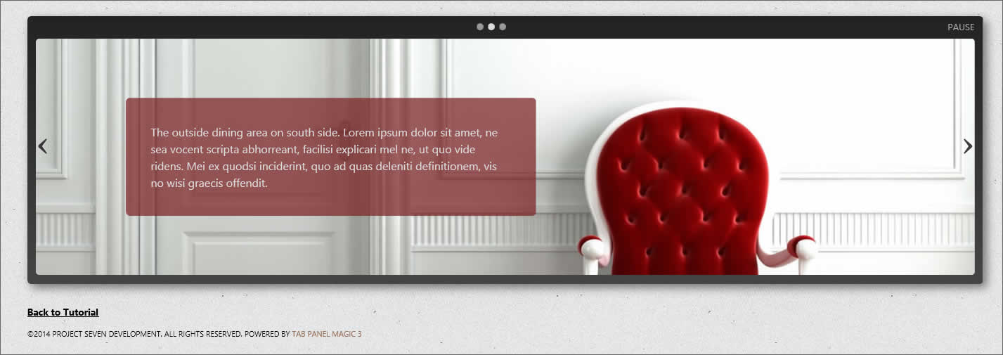
#p7TP3c1_2 .blurb { background-color: rgba(126,39,39,0.75); }
#p7TP3c1_3 .blurb { background-color: rgba(42,75,90,0.75); }
We set individual colors for the fly-in Blurb Box for each content panel.
.p7TP3content .blurb {

      position: relative;

      left: -400px;

      opacity: 0;

      -webkit-transform: scale(5) rotate(-45deg);

      transform: scale(5) rotate(-45deg);

      visibility: hidden;

      }
We stage the Blurb Box animation...scaling 5 times normal size,rotating it 45 degrees, and making it transparent. We also position it off-screen left.
.p7TP3content.current-panel .blurb {

      left: 0px;

      visibility: visible;

      opacity: 1;

      -webkit-transform: scale(1) rotate(0deg);

      transform: scale(1) rotate(0deg);

      -webkit-transition: all 0.5s ease .75s;

      transition: all 0.5s ease .75s;

      }
We finish the Blurb animation by setting transform transitions for the current panel only. The current-panel class is assigned by the TPM3 script to the panel thart is currently in view.
@media only screen and (min-width: 0px) and (max-width: 700px) {

      .blurb {

      max-width: none;

      margin: 3%;

      padding: 20px;

      }

      }
The media query makes the overlay box responsive.
Assets
The images we chose are 1280 pixels by 560 pixels. The width was chosen so that images would be just wide enough to fill the maximum width of the layout.