Overview
Current version: 1.1.3
PVII CSS Class Switcher (SCS) is a free extension designed to help Dreamweaver users leverage the power of CSS to produce engaging behaviors that work in all devices. So, read on and learn how SCS works. You'll be glad you did.
Why you need PVII CSS Class Switcher
There are a lot of reasons. It enables you to add very cool effects to your page, which is pretty obvious. But also consider the following two features that are not so obvious:
1. Mobile/Touch Device Support
If you might think that CSS alone is all you need, you would be wrong. CSS animations, using the :hover pseudo element, work fine on traditional computers that use a mouse. Hover over the element and the animation fires. Move your mouse away and the animation reverses itself, returning your element to its default state. But what about touch devices? Well, that's a big problem, because phones, tablets, and other touch devices do not natively process mouse over and mouse out events. Once you tap your element, it is forever frozen in the :hover state. The CSS Class Switcher handles this seamlessly. Tap once on a phone or tablet and the animation fires. Tap again and the effect reverses. It's kinda like magic.
2. Accessibility and Dreamweaver Editing Support
When you add a CSS Class Switcher effect to your page, the SCS interface automatically adds a special class, called scs-noscript, to the relevant elements on your page. At runtime, the SCS script removes the class. So, you can write remedial rules, based on the scs-noscript class, that accomplishes two things:
a) Ensures that in devices where JavaScript is not running, all of your content is fully accessible.
b) Allows you to write rules that permit all of your content to be easily editable in Dreamweaver Design View.
What you'll learn
Obviously, you'll learn how to use PVII CSS Class Switcher. But there is a related matter—a very important matter—of collateral CSS knowledge! Study the CSS in the lessons and you'll learn about positioning, transitions, transformations, and lots of other things. Read between the lines and you'll witness the power of PVII Harmony: a page layout tool that goes far beyond what can be done with Dreamweaver's built-in layout tools. So, read on...and learn!
Hover over (or tap) the image below to reveal more info
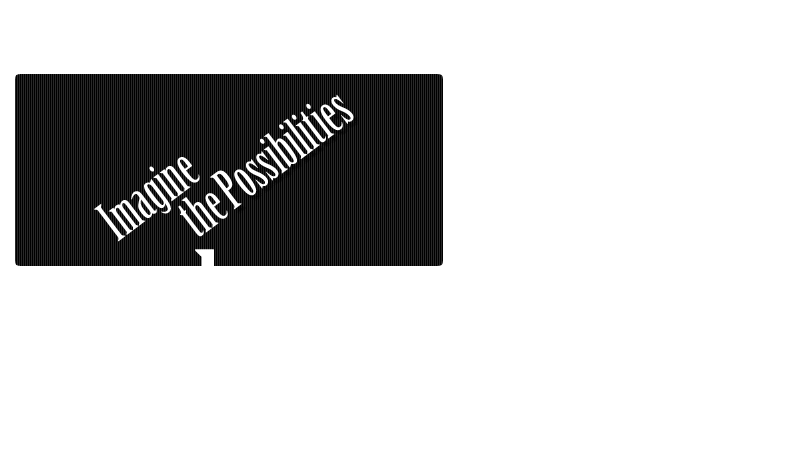
CSS Class Switcher is a powerful tool. The effects you can create and orchestrate are limited only by your imagination. And...in case you were wondering—yes, we will be showing you how we made this little animated effect. So, read on!
Installation
Download CSS Class Switcher
If you have not already done so, download the Class Switcher zip file
Unzip it to a safe location anywhere on your hard drive.
Installing CSS Class Switcher
Extension installer files come in 2 formats: MXP and ZXP. MXPs are supported by Extension Manager versions MX, MX2004, 8, CS3, CS4, CS5, CS5.5 and CS6. ZXP is supported by versions CS5.5 and higher. To install SCS, open your Adobe Extension Manager, click the Install icon or link, and then browse to where you unzipped the installer files.
Dreamweaver CC 2015 (and higher) Extension Installation Information
As of CC 2015, Adobe has ceased to support its own Extension Manager. Use the PVII Extension Manager for Adobe Creative Cloud...
PVII Extension Manager for Adobe CC
( Windows and Mac)
Accessing CSS Class Changer
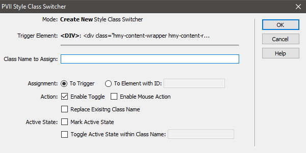
There are 4 ways to access SCS Choose the one most suitable to your workflow. When you open the interface, the system will detect the appropriate mode (Insert or Modify) based on where your cursor is.
When you are Creating a new SCS instance, place your cursor inside the element you wish to trigger the SCS effect. If Modifying an existing instance, place your cursor anywhere inside the triggering element and use one of the 4 methods below to open the UI. The system will always open in the correct mode.
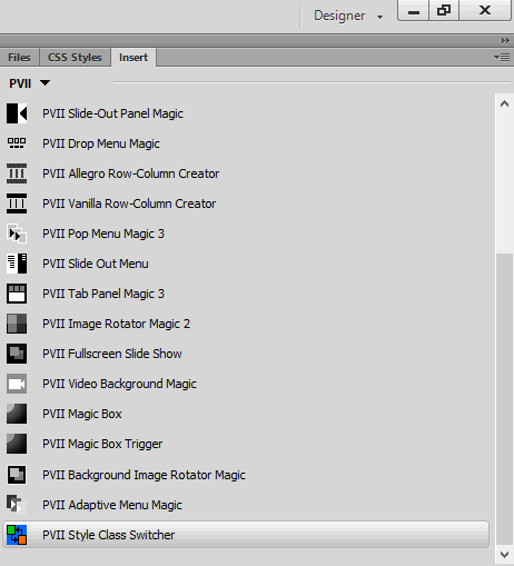
1. Insert Bar
Switch to the PVII category. SCS is the last icon in the screen capture below
Note: If you would like to revise the classic Insert Bar in newer versions of Dreamweaver, please see this tutorial
2. Insert Panel
Switch to the PVII category. SCS is the last icon in the screen capture below
3. Insert Menu
Choose Insert > Studio VII > Style Class Switcher by PVII
If your cursor is not inside another SCS instance, the main UI will open in Create Mode.
If your cursor is inside an existing menu, you will get an intermediary screen asking if you'd like to modify the existing SCS instance or create a new, nested instance:
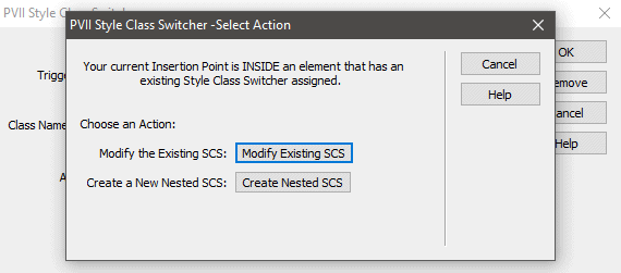
Note: Nesting is discussed below in its own topic.
If you click the Modify button, the UI will open in Modify mode:
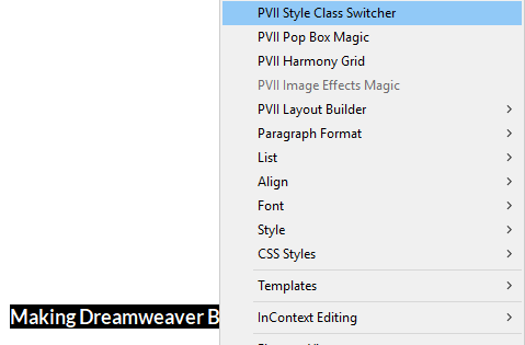
4. Right-Click
Place your cursor inside your desired trigger and right-click. Choose PVII Style Class Switcher.
Using SCS
The SCS interface makes adding effects to your page easy!
Creating a new SCS effect
The UI allows you to easily define and configure an effect. Once configured, the UI can be used to modify (edit) your effect as often as you like. Follow the steps below to create a new effect.
Triggering an effect on the triggering element itself
This is the easiest type of effect to create. Let's say you want to highlight a paragraph of text when it is hovered over, or tapped. To accomplish this, you need to do two things:
a. Create a custom CSS class.
.emphatic {

          background-color: #F00;

          }
Tip: The CSS rules you create can go inside an existing style sheet linked to your page or inside a pair of style tags in the head of your page code. Simply copy the 2 rules above and paste them into your style sheet.
b. Assign an SCS effect to the paragraph
Place your cursor inside the paragraph and open the SCS UI:
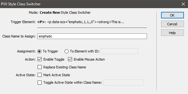
Enter the custom class name, emphatic, in the Class Name to Assign box. In the Action section, check the Enable Mouse Action option.
Click OK
Demo
Demo: Hover over (or tap) the paragraph below:
This is the result. When hovered over, or tapped, this paragraph will turn red.
Taking the Effect to the Next Level
The simple effect above is quick and easy to set up. But let's say you wanted the effect to be animated...for the background color to fade in and then out. How would you do that? Well, it's all about CSS. While advanced CSS coders will know exactly how to use CSS Class Switcher, a non-coding designer might need a little help to get pointed in the right direction. Are you ready to learn? Of course you are.
In order to animate the effect in both directions—when it is assigned and also when it is removed (on mouse over and on mouse out, for example), a CSS transition that defines the animation must first be placed on the target element. This is how we do it:
Create two custom CSS classes:
          .emphatic-animated {

            transition: all linear 0.5s;

            background-color: #699;

            color: #000;

            padding: 10px;

            border: 1px solid;

            }

            .emphatic-animated.triggered {

            background-color: #A00A0A;

            color: #FFF;

            border-radius: 5px;

            }
Tip: The CSS rules you create can go inside an existing style sheet linked to your page or inside a pair of style tags in the head of your page code. Simply copy the 2 rules above and paste them into your style sheet.
The first class [.emphatic-animated] is then assigned directly to the target paragraph:
<p class="emphatic-animated">This paragraph contains an effect that changes background color, foreground color, and border attributes. Mouse over (or tap) to see how it works. When you mouse out (or tap again) the effect will be reversed as the SCS-assigned class is removed and the paragraph reverts to its default styling.</p>
The second class [.emphatic-animated.triggered] is actually a combined selector, which is one of the more powerful CSS techniques you can clip to your CSS tool belt. Combined class selectors string together two (or more) class names with no spaces between them.
In plain English, our combined selector directs the browser to look for elements which have 2 classes assigned: emphatic-animated and triggered.
So, all we need to do is use CSS Class Switcher to assign the triggered class to a paragraph (or other element) that is already assigned the emphatic-animated class:

Demo
Demo: Mouse over (or tap) the paragraph below:
This paragraph contains an effect that changes background color, foreground color, and border attributes. Mouse over (or tap) to see how it works. When you mouse out (or tap again) the effect will be reversed as the SCS-assigned class is removed and the paragraph reverts to its default styling.
Are there other cool things I can do with SCS? Oh yeah. Just read on...
SCS has Remote Control Capabilities...
SCS can also be configured to assign disjointed effects. That is, a click, a tap, or a hover on one element can switch classes on an element elsewhere on your page. Consider this:
You have a considerable amount of additional information relevant to a particular topic on your page. The information is such that only some visitors will want to see that information. Using CSS Class Switcher you can easily keep that information hidden until an interested party click (or taps) a link to access it.
We also want to dress up the trigger link in some fancy duds. Let's start there.
Make a trigger link
Type the words Additional Info... on your page, then turn it into a null link. In code view it will look like this:
<a href="#">Additional Info...</a>
Create the CSS rules for the trigger. For this exercise, we will leverage the power of the Mark Active State option in the SCS UI. When this option is turned on, the triggering element is assigned a special class when the effect is running: scs-active.
Copy the rules below to your style sheet:
.more-info-active {

          /*Set up an animation*/

          transition: all ease-in-out 1.5s;

          color: inherit;

          }

          .more-info-active.scs-active {

          /*Set link text color*/

          color: #69C;

          }

          .more-info-active:before {

          /*Place a right-facing arrow before the link*/

          content: "\25BA";

          }

          .more-info-active.scs-active:before {

          /*Place a down-pointing arrow before the link

            when the SCS effect is in the active state */

          content: "\25BC";

          }
Assign the more-info-active class to your trigger link:
<a href="#" class="more-info-active">Additional Info...</a>
The targeted element
Let's do the CSS rules that affect the targeted element. For a disjointed effect, we need to ID the targeted element so that the SCS script can identify it. Let's use the ID more-info:
CSS Rule #1
#more-info {

          transition: all ease 0.25s;

          line-height: 0;

          opacity: 0;

          }
The more-info ID is assigned to the target information. In this case, a paragraph. IDs can be assigned via the Property Inspector or directly in code. Here is what the target paragraph looks like n Code View after assigning the ID:
<p id="more-info">And this is more information, which was triggered by a CSS Class Switcher effect! In this case, the effect is <strong>disjointed</strong>, meaning that it is assigned to a link that when clicked will assign a class to another element on the page. When you clicked or tapped the <strong>Additional Info...</strong> link, this paragraph is assigned the <strong>triggered</strong> class, which makes it appear!</p>
Fixing Dreamweaver Design View and Browsers with JavaScript Disabled
The SCS UI adds a special class to the SCS trigger and the targeted element (where applicable) called scs-noscript. When the page is run in a browser that supports JavaScript, the scs-noscript class is removed. This allows you to add special style rules that allow your content to be accessible in devices that do not support JavaScript. As an added benefit, this also allows you to fix issues in Dreamweaver Design View.
CSS Rule #2
.scs-noscript#more-info {
/*Dreamweaver Design View and devices not supporting script will display the additional information fully*/
line-height: 1;
opacity: 1;
}
CSS Rule #3
#more-info.triggered {

          line-height: 1.25;

          opacity: 1;

          }
The triggered class is the class assigned to the paragraph by SCS, when the Additional Info... link is clicked or tapped. We set up the effect by creating the trigger link, which we do by typing the words: Additional Info... selecting them, and making them a null link (#).
<p><a href="#">Additional Info...</a></p>
We then place our cursor inside the linked text and open the SCS UI:
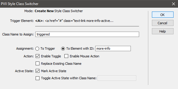
Set your options exactly as they appear in the above screen capture.
Demo
Click the Additional Info link below to see the effect.
And this is more information, which was triggered by a CSS Class Switcher effect! In this case, the effect is disjointed, meaning that it is assigned to a link that when clicked will assign a class to another element on the page. When you clicked or tapped the Additional Info... link, this paragraph is assigned the triggered class, which makes it appear! While we chose to hide and show a paragraph, you can just as easily use a DIV, in which case, your additional info can contain mixed content, such as images, lists, and even forms!
Using the "Replace Existing Class Name" and
"Toggle Active State Within Class Name" Options
There may be times when you want to trigger a series of disjointed effects. Consider a two-column structure with a series of links in the left column that control the color scheme of the right column.
1. Create your 2-column structure and the content inside
We used PVII Harmony for the columns, of course! Add a list of 5 links to the left column. Assign the class color-switcher to the list. You may borrow ours:
<ul class="color-switcher">

          <li><a href="#">Cornflower Blue</a></li>

          <li><a href="#">Citrus</a></li>

          <li><a href="#">Mocha</a></li>

          <li><a href="#">Orange Crush</a></li>

          <li><a href="#">Newspaper</a></li>

          </ul>
Add a DIV to the right column to house your content. Assign the class color-canvas to the DIV. Again, you may borrow our code:
<div id="color-canvas">

          <h3>The World is a Carousel of Color</h3>

          <p>Lorem ipsum dolor sit amet, ne sea vocent scripta abhorreant, facilisi explicari mel ne, ut quo vide ridens. Mei ex quodsi inciderint, quo ad quas deleniti definitionem, vis no wisi graecis offendit. Ius ut everti detraxit expetenda, meis civibus consectetuer ea usu. Ad qui option facilisis consequuntur, pro omnis aliquip vulputate te. Solum affert expetenda eos te, et vim sale iudico impetus, in appetere postulant ius. Alia nihil utroque ex sit. Facilisius explicari mel, ut quo vide ridens. Mei ex quodsi inciderint, quo ad quas deleniti definitionem, vis no wisi graecis offendit. Ius ut everti detraxit expetenda, meis civibus consectetuer ea usu. Ad qui option facilisis consequuntur</p>

          </div>
2. Create the necessary CSS rules for the left and right columns
Copy the following rules to your style sheet:
          .color-switcher {

            /*Reset margin and padding on links UL*/

            margin: 0;

            padding: 0;

            }

            .color-switcher li {

            /*Remove bullets and set margin on list

              items in links UL*/

            list-style-type: none;

            margin: 6px;

            }

            #color-canvas {

            /*Set up an animation on the right-column DIV

              Also set default background and foreground colors,

              border-radius, border, and padding. */

            transition: all ease-in-out 1s;

            background-color: rgb(20,20,20);

            color: #fff;

            border-radius: 5px;

            padding: 24px;

            border: 1px solid rgba(255,255,255,0.5);

            }

            /*The following ID selectors will be manipulated by SCS to change the color theme of the right column when clicking or tapping the links in the left column. For example, when you click the Cornflower link in the left column, SCS will be configured to assign the cornflower class to the color-canvas DIV.*/

            #color-canvas.cornflower {

            background-color: rgb(100,149,237);

            color: #FFF;

            }

            #color-canvas.lime {

            background-color: rgb(120,187,47);

            color: #FF3;

            }

            #color-canvas.mocha {

            background-color: rgb(102,77,68);

            color: #C6B0A8;

            }

            #color-canvas.orange {

            background-color: rgb(255,153,0);

            color: #FFF;

            }

            #color-canvas.newspaper {

            background-color: rgb(20,20,20);

            color: #FFF;

            }
3. Set up the CSS styles for the Trigger Links
These styles define the look and behavior of the links in the left column. Copy them to your style sheet.
          .color-switcher a {

            /* Set up an animation effect for the links.

              Define them as blocks with padding, opacity, background &

              foreground colors, as well as border attributes.*/

            transition: all linear 1s;

            opacity: .70;

            text-decoration: none;

            display: block;

            padding: 10px 15px;

            color: #FFF;

            background-color: #151515;

            border: none;

            border-radius: 5px;

            }

            .color-switcher a:before {

            /*Set a diamond character to appear to the left of the link text*/

            content: "\2666";

            padding-right: 6px;

            }

            .color-switcher .scs-active {

            /*Change opacity to 1 (fully opaque) and color to red

              when SCS assigns the scs-active class to the link.*/

            opacity: 1;

            color: #C30;

            }
          /*Set a media query that turns the links from vertical block items to

            horizontal inline-block items on browsers and devices less than 769px wide*/

              @media only screen and (min-width: 0px) and (max-width: 768px) {

            .color-switcher li {display: inline-block;}

            }
Tip: You can create easy, responsive multi-column layouts using PVII Harmony Page Layout Builder. That's what we used!
3. Set up the SCS Effects
We're going to assign an SCS effect to each of the links in the left column.
Place your cursor inside the first link Cornflower Blue.
Open the SCS interface
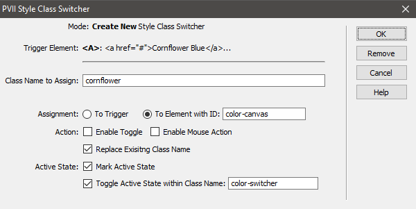
Set your options exactly as we have in the above screen capture. Here's what they mean:
The class name cornflower will be assigned to Element with ID: color-canvas.
Enable Toggle and Enable Mouse Action are both turned off (unchecked). Disabling the toggle simply ensures that clicking or tapping a link a second time will not fire an SCS effect.
Replace Existing Class Name ensures that when a link is clicked (or tapped) all classes, including those previously assigned by SCS, are removed from the target element (color-canvas), and a new class assignment is set based on the SCS effect for the trigger being used.
Mark Active State, tells SCS to assign the scs-active class to the trigger you have clicked or tapped.
Toggle Active State within Class Name: color-switcher tells the browser to look at all elements inside the color-switcher element (which is your list of links) and remove the scs-active class on each element—except the one that was just clicked or tapped.
Check out the demo below. If you've followed all the steps, your color switcher should work just like ours.
Demo
Click or tap the Pick a Color Theme links to see the effect.
Pick a Color Theme
The World is a Carousel of Color
Lorem ipsum dolor sit amet, ne sea vocent scripta abhorreant, facilisi explicari mel ne, ut quo vide ridens. Mei ex quodsi inciderint, quo ad quas deleniti definitionem, vis no wisi graecis offendit. Ius ut everti detraxit expetenda, meis civibus consectetuer ea usu. Ad qui option facilisis consequuntur, pro omnis aliquip vulputate te. Solum affert expetenda eos te, et vim sale iudico impetus, in appetere postulant ius. Alia nihil utroque ex sit. Facilisius explicari mel, ut quo vide ridens. Mei ex quodsi inciderint, quo ad quas deleniti definitionem, vis no wisi graecis offendit. Ius ut everti detraxit expetenda, meis civibus consectetuer ea usu. Ad qui option facilisis consequuntur
Would you like to learn how to orchestrate an ultra-cool animation effect?
Of course you would. Read on, please...
Orchestrating Cool Animations with SCS
As you surely noticed, there is a really neat animation effect on the CSS Class Switcher home page. Let's see how it was done.
Note: If you'd like to use our image, right click this link and save the image to a folder inside your local Dreamweaver site. You can, however, use any image you like. Note also, that because this page was made using PVII Harmony, all images are automatically responsive. Yours might not be if your page was laid out using Dreamweaver's page building tools, so do be mindful of your image's size.
The code for this effect is extremely simple.
1. Copy the block below to your page in Code View:
<div class="criss-cross>

<p><img src="../images/shot-1.png" width="800" height="450" alt=""></p>

<div class="caption">

<p><strong>CSS Class Switcher is a powerful tool.</strong> The effects you can create and orchestrate are limited only by your imagination!</p>

</div>

</div>
Adjust the image name and path if needed.
2. Add the Necessary CSS Rules to your style sheet:
/*The animation container.*/

          .criss-cross {

overflow: hidden;

position: relative;

padding: 20px;

border-left: 1px dotted;

border-right: 1px dotted;

}

/*Reset margins inside all paragraphs within the container.*/

.criss-cross p {

margin: 6px 0px;

}

/*The Caption element which slides down. This element is a DIV and can contain any type of content, including paragraphs, links, and even images. A CSS transition is set for the transform and opacity properties. The initial animation state sets a vertical translate (offset) of -600px and opacity to zero (totally transparent). The element is absolutely positioned with a bottom position of 10px.*/

.criss-cross .caption {

transition: transform ease-out 1s, opacity linear 1s;

transform: translateY(-600px);

opacity: 0;

position: absolute;

bottom: 10px;

left: 0px;

width: 100%;

padding: 0px 10px;

color: inherit;

font-size: 140%;

}

/*SCS will set the class of this element to running when the criss-cross element is hovered over or tapped, which will trigger the animation. Offset (translateY) will rest the vertical position of the element to zero and opacity will be set to 1 (fully opaque). When your cursor moused off the element (or when it is tapped again), the animation will reverse.*/

.running .caption {

transform: translateY(0px);

opacity: 1;

}

/*The image inside the container is set to animate the transform and opacity properties: the same properties used for the caption animation.*/

.criss-cross img {

transition: transform ease-out 1s, opacity ease .5s;

transform: translateY(0);

opacity: 1;

border-radius: 5px;

display: block;

}

/*When SCS assigns the running class, the image will translate vertically upwards (-600px) and opacity will cause it to fade out to zero (fully transparent).*/

.criss-cross.running img {

transform: translateY(-600px);

opacity: 0;

}

/*When SCS is assigned to the criss-cross container, a class of scs-noscript is automatically assigned. This class allows you to make your animated content acessible in browsers that do not support JavaScript and also to make sure your content is easily editable in Dreamweaver Design View.*/

.criss-cross.noscript,

.criss-cross.scs-noscript .caption,

.criss-cross.scs-noscript img {

position: static;

}
3. Set up the SCS Effect
Open the SCS UI:
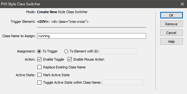
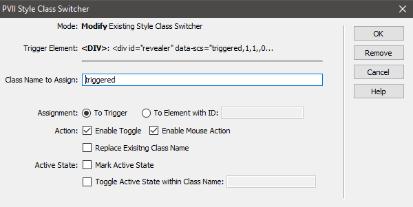
Make sure the Trigger Element is <div class="criss-cross">
Assign your SCS options exactly as they appear in the above screen capture.
Click OK
Demo
Mouse over or tap the image below to see the effect.
CSS Class Switcher is a powerful tool. The effects you can create and orchestrate are limited only by your imagination!