We listened to your suggestions! Info Slider now features several new and exciting features, along with various enhancements that make it better than ever. Please read on to learn more...
Paginators are little dots that can be set to appear above or below your Info Slider. These dots serve 2 purposes. They provide feedback to visitors, indicating how many Slider viewports are available to scroll. Paginator dots also serve as links to their relevant viewports.
The Info slider UI gives you the ability to set default, hover, and selected state colors for your Paginator dots, allowing you to accommodate any design!
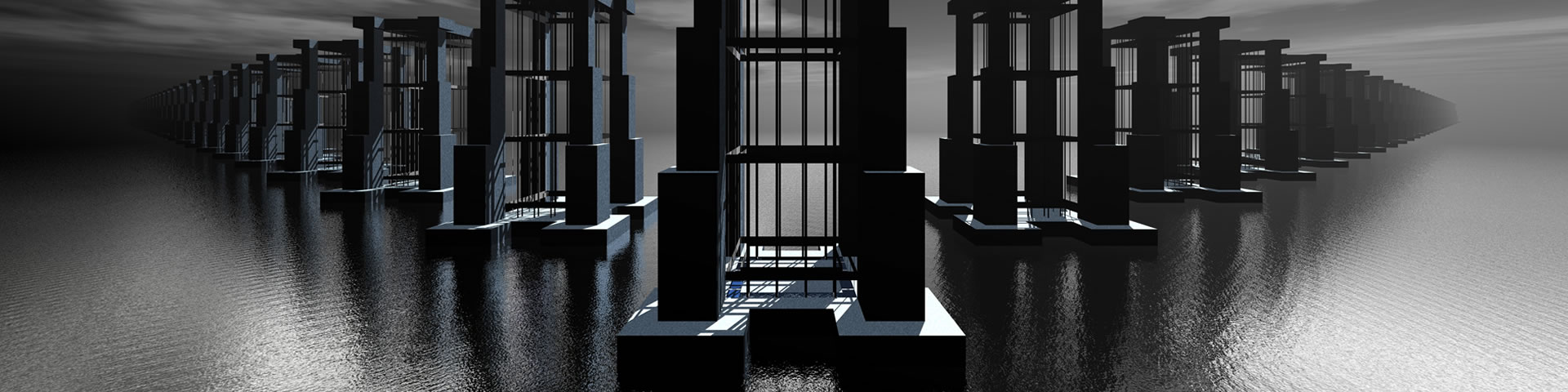
The following Info Slider displays a Paginator below the panels:
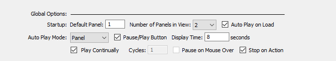
By popular demand, we've added a very cool Auto Play feature to Info Slider (v. 1.1.4). This mode can be configured to start on page load or you can opt to give users full control by providing them with a Pause/Play button.
Additionally, you set an Auto Play Mode to slide one panel at a time, or the entire viewport. And, of course, you can also set the number of seconds between slides with the Display Time option.
If you not to show a Pause/Play button, you will be able to set the slider to Pause on Mouse Over. A Stop on Action option can also be set, which will cause Auto Play to stop if you use the left or right arrows to advance or reverse the slider.
The latest version of Info Slider adds an Auto Play mode. In addition, you can also opt to display a Pause/Play button inside the slider, at the bottom right corner. This feature puts a finishing touch on Info Slider, making truly a one-of-a-kind tool for Dreamweaver users. You cannot do this with Bootstrap!
When Auto Play is selected, you can also select how many cycles to run. You can run 1 or more specific cycles or you can set the slider to run continuously. When the slider reaches the end, it will reverse direction.
The Pause/Play button is displayed at the bottom right edge of the slider.
If you opt not to show a Pause/Play button, you can set the slider to automatically pause when a user points his or her mouse over any part of the slider. This option is grayed out if you have opted to show a Pause/Play button.
The above example uses a customized Paginator. Size and shape have been reset to display rectangular graphics by editing the height, width, and border-radius of the .ism-paginator a class.
PVII is constantly tweaking and improving its products, so the above features are not the end! We've added more features and options. Including the following:
We've increased the number of panels you can display in a viewport from 6 to 10.
You can now externally link directly to a specific panel in your slider, using the following syntax methods:
Use the following syntax, appended to the end of an ordinary link: ?ism=1_5, which will link to the 5th panel in the first Info Slider on your page. Here is a live example:
Use the following syntax, appended to the end of an ordinary link: #ism1_5, which will link to the 5th panel in the first Info Slider on your page. Here is a live example:
Museum-grade galleries in Dreamweaver
Responsive & Adaptive
Works with Dreamweaver Templates
No coding Required
Display from 1-10 Panels
Over 1000 color combinations available
Auto Play Mode with Pause and Play control
Rounded corner and border options
Display Customizable Paginators
Smooth Sliding Animation
Modify and Edit at Any Time
And much more...