Tree Menu Magic 3 Style GuideFrom PVII: the leader in responsive Dreamweaver tools

Tree Menu Magic 3 is automatically responsive and works perfectly on all mobile devices.
The TMM3 Style Guide
For this guide we are going to examine the TMM3 Cayenne Theme CSS file: p7TM3-03.css. All TMM3 style sheets have the same basic structure. Understand this one and you will understand all of them.
.p7TM3-03
font-size: 1em;
padding: 10px;
background-color: #C30;
background-image: linear-gradient(#D04444, #B42D2D);
font-family: "Segoe UI", "Gill Sans", Optima, "Droid Sans", sans-serif;
This is the root menu container. Background-image is a CSS linear gradient that begins with color #D04444 (medium rose) and ramps to a darker rose (#B42D2D).. In the absence of a direction value, linear gradients render from top to bottom. A background color that falles between the starting and ending gradients is set as a fallback for older browsers. Font-family is declared for the entire menu.
.p7TM3-03.outer-shadow
box-shadow: 0px 0px 20px rgba(0,0,0,.5);
If the Outer Shadow option is enabled in the TMM3 interface, this rule takes effect and renders a shadow around the outer perimeter of the menu. Shadow syntax is simple: 0px (horizontal offset) 0px (vertical offset) 20px (blur radius) rgba(0,0,0,.5) (shadow color). Shadow color is set in RGBA format. See discussion on RGBA at end of guide.
.p7TM3-03.rounded-corners
border-radius: 5px;
If the Rounded Corners option is enabled in the TMM3 interface, this rule takes effect and renders rounded corners around the outer perimeter of the menu, and also around inner elements of the menu where it makes logical design sense.
.p7TM3-03.rounded-corners ul ul
border-radius: 5px;
If the Rounded Corners option is enabled in the TMM3 interface, this rule takes effect and renders rounded corners around the sub-menu UL elements.
.p7TM3-03:after (do not edit)
content: "\0020";
font-size: 0px;
display: inline;
overflow: hidden;
line-height: 1;
This rule addresses a bug in IE10 that would otherwise cause visual artifacts to appear as the menu glides up and down... when box-shadows or rounded corners are assigned.
.p7TM3-03 ul
margin: 0px;
padding: 0px;
The menu UL element has default padding and margins removed.
.p7TM3-03 ul ul
padding: 10px 0px;
background-color: #252525;
background-image: linear-gradient(180deg, #333, #000);
This rule defines the sub-menu UL elements. Top/bottom padding is set to 10px. Background-image is a CSS linear gradient with a fallback background-color for older browsers. Gradient angle is set to 180deg, which causes the gradient to go from left to right.
.p7TM3-03 ul ul ul
border: none;
margin-bottom: 0px;
padding: 0px;
background: none;
box-shadow: none;
This rule defines the sub-sub menu level. Essentially, we are turing off attributes assigned to the root menu UL and the first sub-menu level UL.
.p7TM3-03 li
list-style-type: none;
margin: 0;
This rule defines the menus LI items. We turn off bullets and zero out the margins.
.p7TM3-03 ul ul ul li
padding-left: .5em;
We set left padding on the LI elements in the sub-sub menu level to indent them.
.p7TM3-03 ul a
color: #111;
display: block;
padding: 3px 8px 3px 18px;
text-decoration: none;
The root level links. The 18px of left padding is there to accommodate arrows for links that have sub-menus.
.p7TM3-03 ul a:hover,
.p7TM3-03 ul a:focus
color: #000;
text-shadow: -1px 0px 0px #333333;
outline: none;
The root menu hover/focus style. A minimal text-shadow effect, drawing an opaque stroke to the left of each character is a way to make text bold without altering its renedered width.
.p7TM3-03 ul ul a
font-size: .9em;
border: none;
color: #999;
The sub-menu links.
.p7TM3-03 ul ul a:hover,
.p7TM3-03 ul ul a:focus
color: #CCC;
The sub-menu link hover and focus class.
.p7TM3-03 a.trig_closed
background-image: url(img/tm3_east_black.gif);
background-repeat: no-repeat;
background-position: left center;
Assigns a right-pointing arrow to the links that have associated sub-menus. We supply arrows in black, gray, and white. So if you edit your menu colors you can easily change to a logically colored arrow by changing the color in the image name to black, gray, or white. Note that the Classic and Neon themes use plus and minus symbols.
.p7TM3-03 ul ul a.trig_closed
background-image: url(img/tm3_east_gray.gif);
Since the Cayenne sub-menus have a dark background, we change the arrows for sub-menu triggers to gray.
.p7TM3-03 a.trig_open
background-image: url(img/tm3_south_black.gif);
background-repeat: no-repeat;
background-position: left center;
color: #000;
text-shadow: -1px 0px 0px #000;
Assigns a down-pointing arrow to the links that have associated sub-menus when the sub-menus are showing. The text-shadow simulates bold without altering the rendered width of the link.
.p7TM3-03 ul ul a.trig_open
background-image: url(img/tm3_south_gray.gif);
color: #EEE;
Sub-menu trigers when their sub-menus are showing.
.p7TM3-03 a.current_mark
text-shadow: none !important;
font-weight: bold;
Current-marked links are links that match the address of the current page. We turn off text-shadow and set font-weight to bold in order to support older browsers.
.p7TM3-03 ul ul a.current_mark
No properties defined
The current-mark class for sub-menu links inherits properties from the root class rule. We provide this empty rule in case you want to define specific properties for sub-menu current-marked links.
.p7TM3-03_toggle_all
margin: 0 0 12px 0;
display: block;
font-size: .75em;
text-transform: uppercase;
The rule defines the DIV that houses the Open All/Close All links that you can optionally set in the UI to appear above your menu.
.p7TM3-03_toggle_all a
color: #000;
The Open All/Close All links.
.p7TM3-03_toggle_all a:hover,
.p7TM3-03_toggle_all a:focus,
.p7TM3-03_toggle_all a:active
color: #C30;
outline: none;
background: none;
The Open All/Close All links hover, focus, and active states.
.p7TM3-toolbar
display: none;
Toolbar for Smartphones to Hide or Show entire menu. It is hidden by default and revealred, via media query, only when the screen width reaches 700px or less in width.
.p7TM3-03 a:active
background-color: transparent;
Since IE10 is designed for both conventional and touch screens, Microsoft built in a feature that automatically sets a complementary background color on links when a user taps. This feature also comes into play when a link is clicked with a mouse. This rule disables that feature.
Smartphone Menu Media Query
The following Media Query targets smartphones and narrow windows. Please limit yourself to color changes only—unless your CSS skills are fairly advanced.
@media only screen and (min-width: 0px) and (max-width: 700px)
.p7TM3-03_toggle_all
display: none;
This hides the Open All/Close All links that you can optionally set in the UI to appear above your menu. On a smartphone they would take up too much vertical space. If you've set the option in the TMM3 UI, and you do want these links to appear in smartphones, simply change the display property to block.
.p7TM3-03.responsive .p7TM3-toolbar
position: relative;
z-index: 999;
display: block;
text-align: right;
padding: 0px;
cursor: pointer;
If you've enabled Responsive Conversion in the TMM3 interface, this rule defines the toggle bar that appears above the menu and allows users to hide or show the entire menu at will.
.p7TM3.responsive ul.closed (do not edit)
display: none;
The closed class is assigned to the root menu UL programmatically, based on the state of the toggle bar, and serves to hide the menu when the toggle bar is clicked.
.p7TM3.responsive ul.opened (do not edit)
display: block;
The opened class is assigned to the root menu UL programmatically, based on the state of the toggle bar, and serves to show the menu when the toggle bar is clicked.
.p7TM3-03.responsive .p7TM3-toolbar img
display: block;
padding: 0px;
margin: 0px;
The icon image displayed on the toggle bar.
This document will evolve to include additional information. If there is anything you are unsure about please do not hesitate to ask for support. PVII Support Home...
Editing and determining RGBA colors
The following procedures will enable you to convert HEX colors to RGBA in Dreamweaver CS5 and under. Dreamweaver CS5.5 and up have native support for RGBA built in.
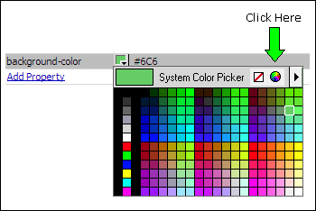
RGBA stands for Red-Green-Blue-Alpha. Each value is separated by a comma. The alpha value allows you to set a transparency level for the element being colored—be it a background color, a text color, or a border color. White (255, 255, 255) and black (0, 0, 0) are easy. Dreamweaver can help you to determine the RGB values using its standard color picker tool.
In your CSS Styles panel, select the rule you want to edit. Start by assigning a Hex color. Let's say #6C6. Open the color picker. Then click the System Color Picker icon:
The System Color Picker will open:
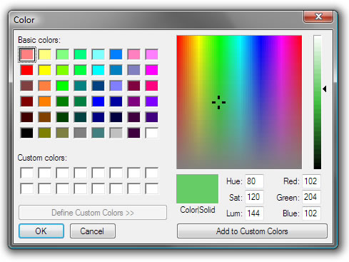
Your RGB numbers are listed as the Red, Green, Blue values: 102, 204, 102. So change your color value to:
rgba(102,204,102,1);
Remember, the "1" at the end is the alpha value and means your color is fully opaque (no transparency). To set transparency, choose a decimal value between 1 and 0. For example, to set 50% transparency, your values would be:
rgba(102,204,102,.5);