Maxi Menu Magic TutorialChanging Column Order for Maxi Sub Columns in Mobile Phones
Buy Now | User Guide | Examples | Tutorials Home | Product Home
Part 1: Reordering Column Positions in Maxi Sub-Menus
One of the more powerful features of the Flexbox specification is the ability to change the order in which flex elements appear on your page. This is but one the reasons why Maxi Menu Magic is so special! The sample menu below has a Maxi mega sub-menu with 3 columns. The center column is pretty-much decorative. Although it looks great on wide screens in its default center position, it will take up too much valuable vertical space on the phone. Optimally, we would like to see center column display last on a phone. With Maxi Menu Magic, this can be done easily.
Here's how to do it
Given a Maxi Sub Menu with 3 columns, assign a User Class to each Section in the MXM UI.
Right-click on your Maxi sub in design view and open the Maxi Sub Layout Manager
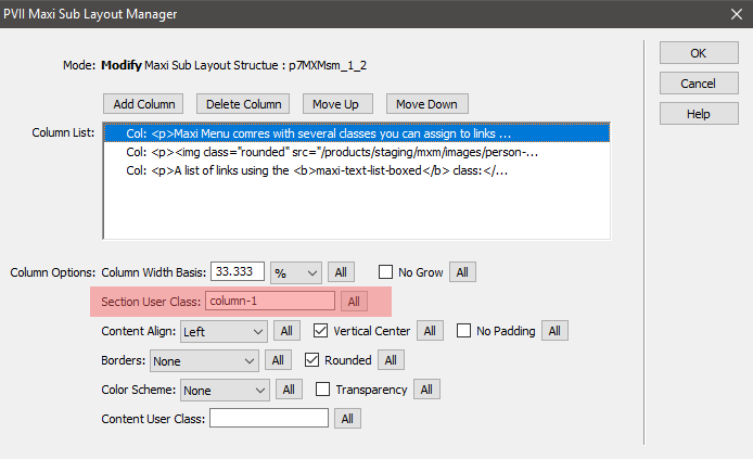
Select the first column and enter column-1 in the Section User Class box.
Select the second column and enter column-2 in the Section User Class box.
Select the third column and enter column-3 in the Section User Class box.
Create the base styles in the head of your document or in a custom style sheet assigned to your page
To place the styles in the head, switch to code view and make a new line just above the closing </head> tag. Copy the following code block and paste it onto the new line.
<style>

          .column-1 {order: 1;}

          .column-2 {order: 2;}

          .column-3 {order: 3;}

          </style>
Create a media query to change the order
We put copies of the classes inside a media query set to run when the screen is 768px wide or less. You can change the 768px breakpoint to whatever you want. We're changing the order. We'll assign column 1 an order of 2, column-2 an order of 3, and column-3 an order of 1.
@media only screen and (min-width: 0px) and (max-width: 768px) {

          .column-1 {order: 2;}

          .column-2 {order: 3;}

          .column-3 {order: 1;}

          }
Note: When assigning order, all sections in the Maxi Sub Menu, must be assigned an order.
View Sample
Part 2: Hiding Maxi Sub Menu Columns for Small Screens
Your client tells you that he'd rather the column that contains the image not display on small screens in order to maximize vertical space. Can we address this? It's really quite easy. Read on to find out how we did it.
Here's how we did it
In the Maxi Sub Layout Manager, select the second column and assign it a Section User Class of hide-me.
Now all you need is a simple media query. And here it is:
@media only screen and (min-width: 0px) and (max-width: 768px) {

          .hide-me {display: none;}

          }
View Sample
Measured against other menu building tools, Maxi Menu Magic simply has no equal. PVII tools make Dreamweaver better.